Flash Crash
Revisited
Our Feed Saturation Ratio makes May 6th stand out |
One metric we use to measure severe feed saturation is the ratio of the number of messages
in one second to the number of messages in 2 milliseconds (ms). The exchange feeds
shown here generally queue high bursts of data at approximately 2 ms intervals.
So this 2 ms interval become the absolute maximum message rate for that feed. Dividing
the number of messages over a 1 second interval by this absolute maximum gives us
a very good indication of feed saturation. By plotting this ratio for every trading
day for a year preceding the flash crash, we can see just how unique
May 6th was in
terms of feed saturation.
Of the many different metrics we looked at, only two really stand out which separate
May 6th from other trading days: the
feed saturation ratio shown on this page, and the frequency of the
Disruptor algorithm. It is interesting that the final
SEC report downplays feed saturation as a cause of the flash crash. It is incomprehensible
that they only looked at the preceding 3 trading days in making that determination.
Please see also:
Order Book Depth,
CQS Saturation, and
Direct Feed Saturation.
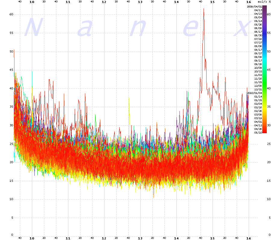
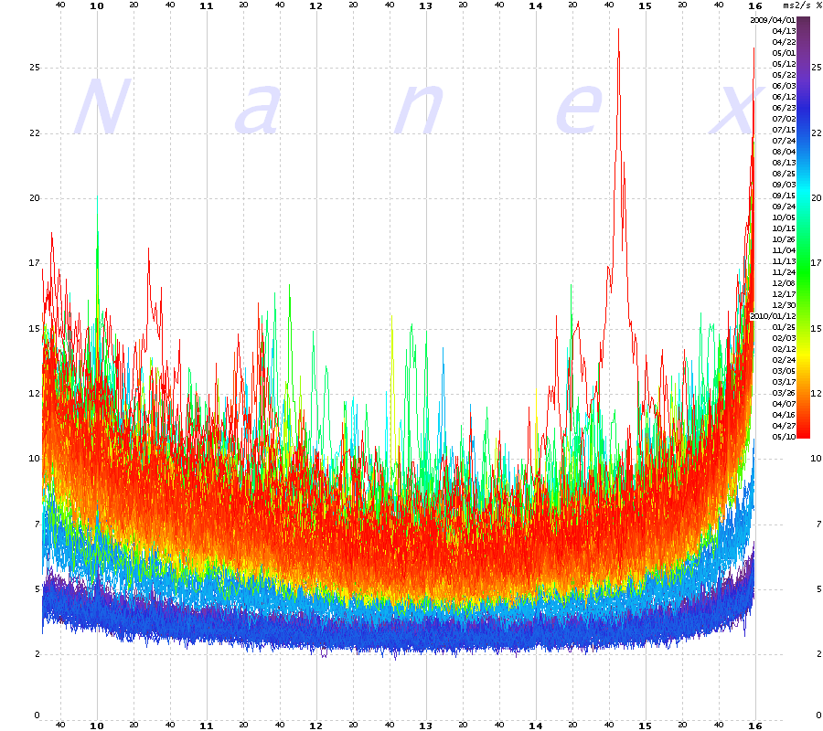
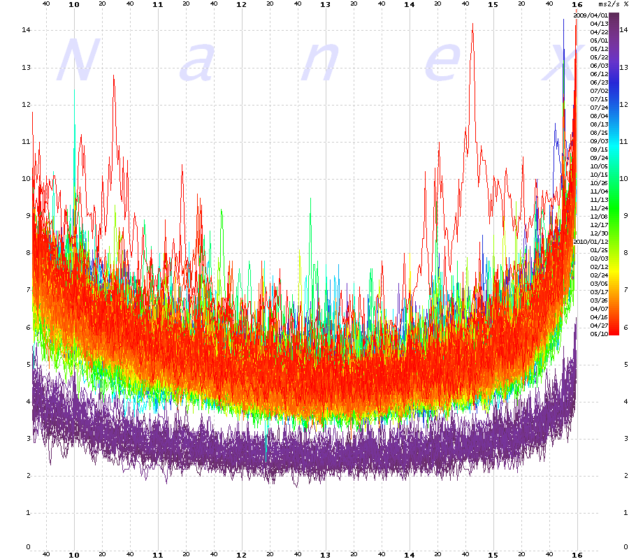
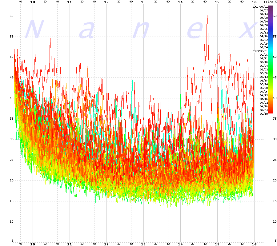
Each chart plots the 1 minute average of the feed saturation ratio for each minute
of the trading day between April 1, 2009 and May 10, 2010. Older days are colored towards
the violet end of the spectrum and more recent days towards to red end. May 6 is the
deep red colored line that sticks out above the others.
Note how unusually high saturation
was already detectable much earlier in the day.
Also we found that the saturation ratio enters record territory at about 14:42:44 -- which we previously identified
as the ignition point -- when the
first HFT emini sale slammed the market. |
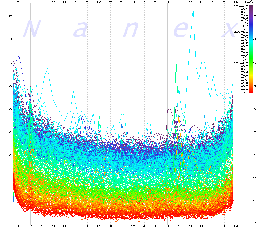
CQS: NYSE/AMEX/ARCA Equity Quote Feed Saturation Ratio

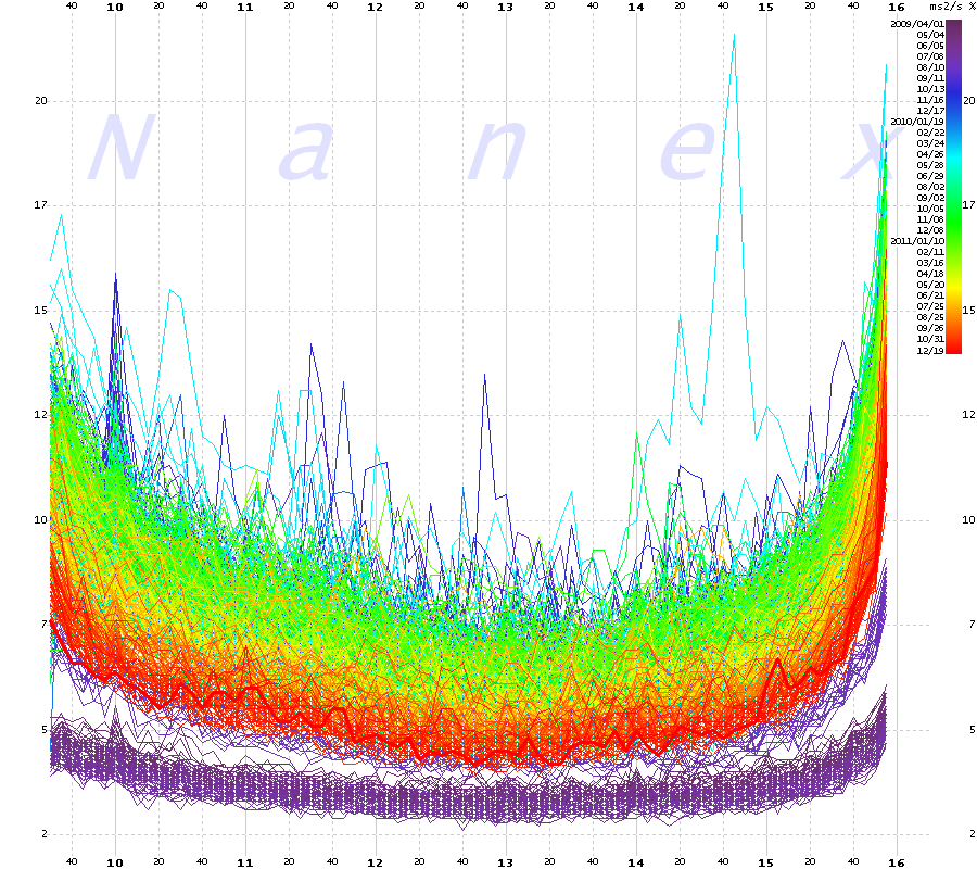
CTA: NYSE/Amex/Arca Last Sale Feed Saturation Ratio

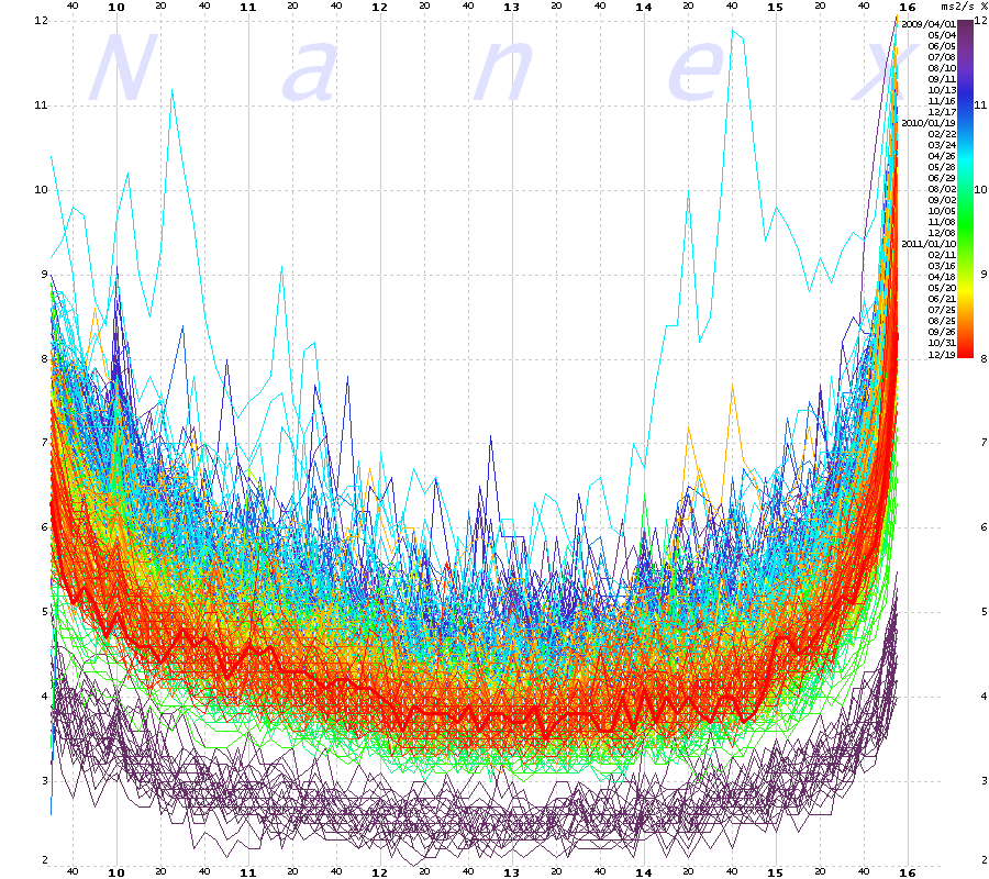
UTDF: Nasdaq Last Sale Feed Saturation Ratio

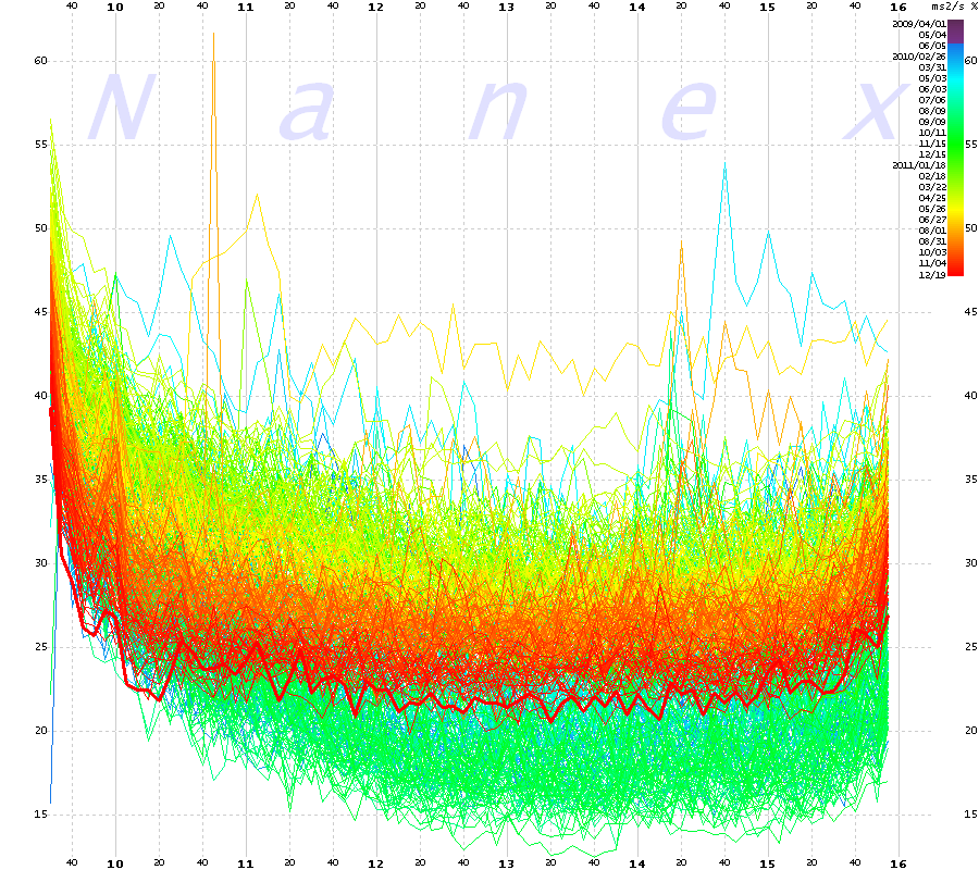
OPRA -- Option Quote and Trade Feed Saturation Ratio

| The next 4 charts show the same feeds as above, but using 5 minute intervals and data from April 2009 through December 19, 2011.
May 6 is the light cyan colored line that sticks out above the others.
|
CQS: NYSE/AMEX/ARCA Equity Quote Feed Saturation Ratio (5 minute average, April 2009 - December 19, 2011)

CTA: NYSE/Amex/Arca Last Sale Feed Saturation Ratio (5 minute average, April 2009 - December 19, 2011)

UTDF: Nasdaq Last Sale Feed Saturation Ratio (5 minute average, April 2009 - December 19, 2011)

OPRA -- Option Quote and Trade Feed Saturation Ratio (5 minute average, April 2009 - December 19, 2011)

|
Inquiries: pr@nanex.net
Publication Date: 12/20/2011
http://www.nanex.net
| This report and all material shown on this
website is published by Nanex, LLC and may not be reproduced, disseminated, or
distributed, in part or in whole, by any means, outside of the recipient's
organization without express written authorization from Nanex. It is a
violation of federal copyright law to reproduce all or part of this publication
or its contents by any means. This material does not constitute a solicitation
for the purchase or sale of any securities or investments. The opinions
expressed herein are based on publicly available information and are considered
reliable. However, Nanex makes NO WARRANTIES OR REPRESENTATIONS OF ANY SORT
with respect to this report. Any person using this material does so solely at
their own risk and Nanex and/or its employees shall be under no liability
whatsoever in any respect thereof. |
|
|
|
