Nanex Research

Nanex ~ 15-May-2012 ~ Chaos is Good (for some)
(for some).
On November 1, 2011, shortly after the release of the
ISM Manufacturing Index, and
Construction Spending, the market became extremely volatile. While looking
through this pile of data in SPY while researching data for a
CNBC interview, we came across some very interesting, if not disturbing
charts.
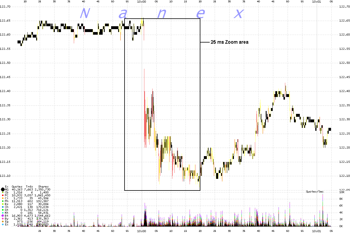
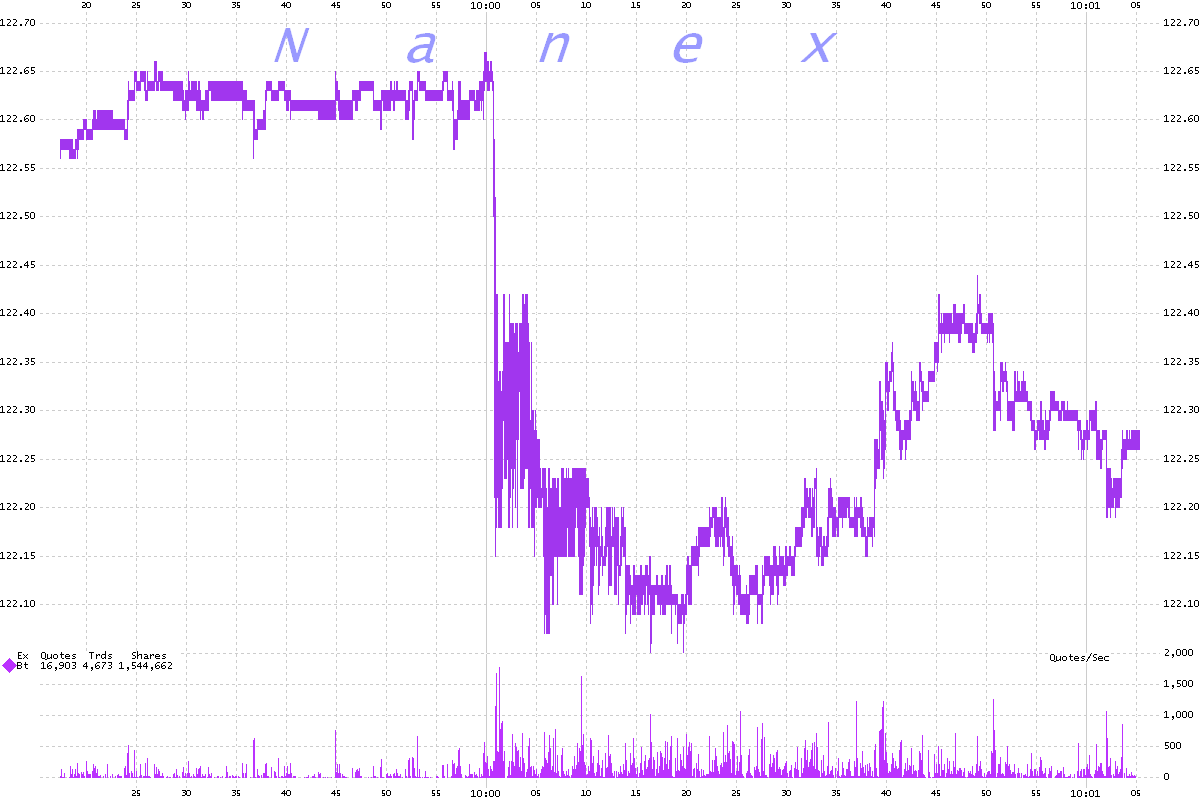
The first set of charts (a) shows the
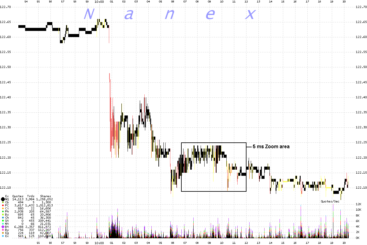
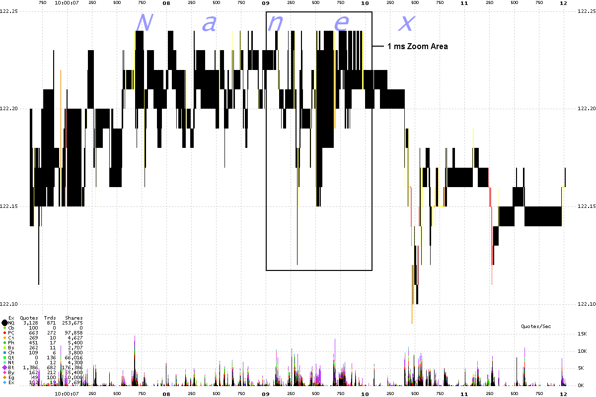
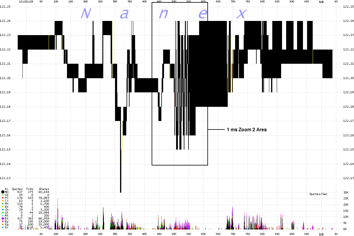
NBBO (shaded black for normal market, yellow if best bid = best ask, and red if best bid > best ask). We zoom from 100 millisecond
interval charts to 1 millisecond interval charts.
1a. 100 ms Interval Chart

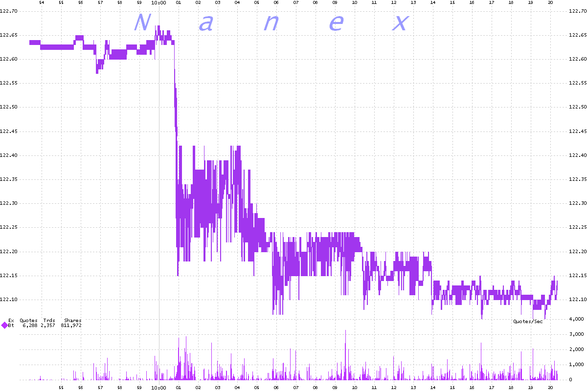
2a. 25 ms Interval Chart Note how the prices look spiky - like they
are bad prints.

3a. 5 ms Interval Chart Prices still look spiky.

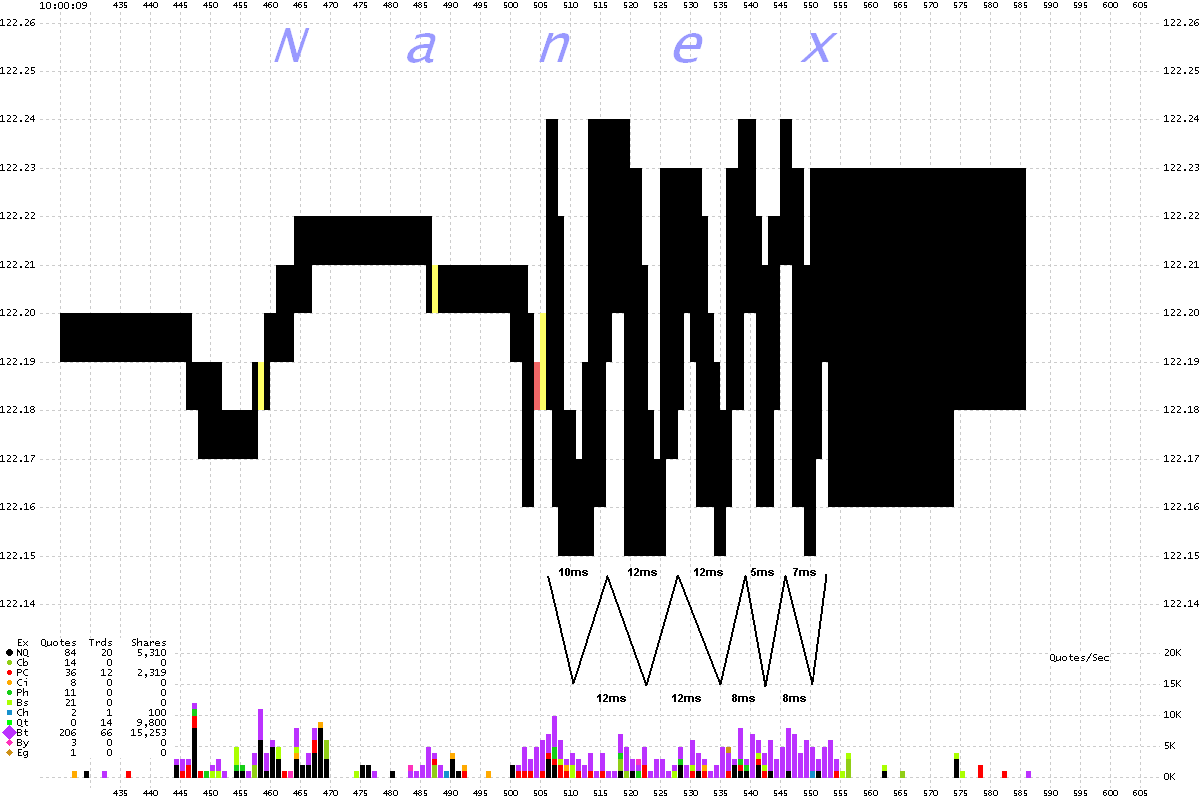
4a. 1 ms Interval Chart Now we can see those spikes are actually
tiny structures.

5a. 1 ms (Zoom 2) Interval Chart Those aren't price spikes!
Looks at those oscillations! The NBBO swings about 5-7 cents every every 5-12 milliseconds
(see drawing below).

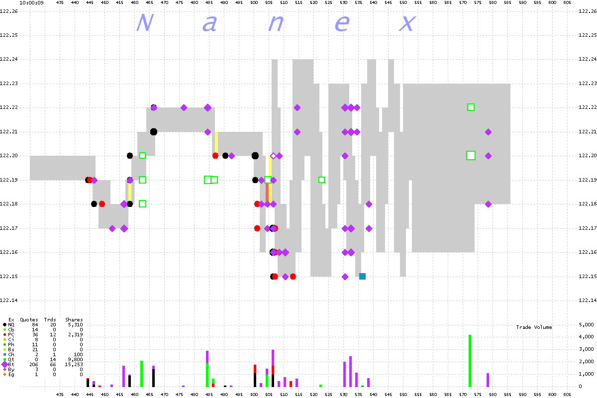
6a. 1 ms (Zoom 2) Interval Chart
Shows trades color coded by exchange. Note all the trades from
BATS during the oscillations
(pink diamonds). This is called harvesting the gold after shaking the money tree.

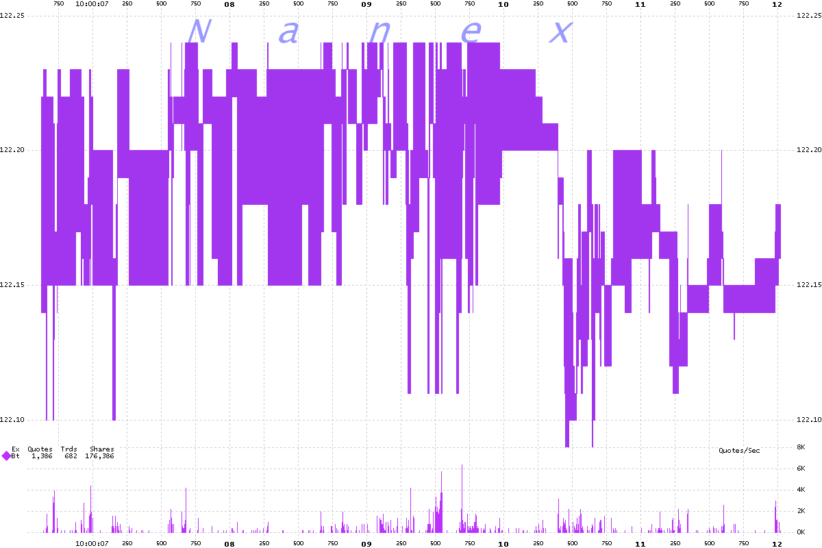
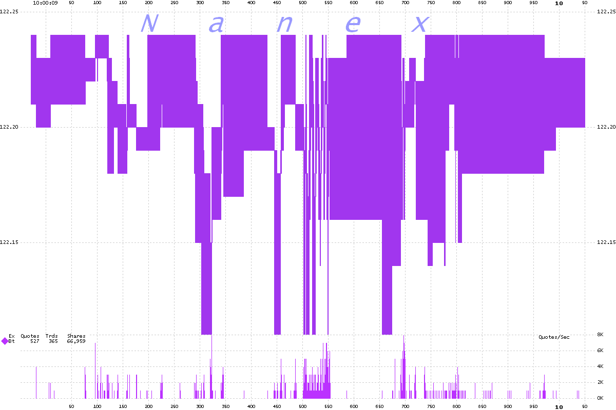
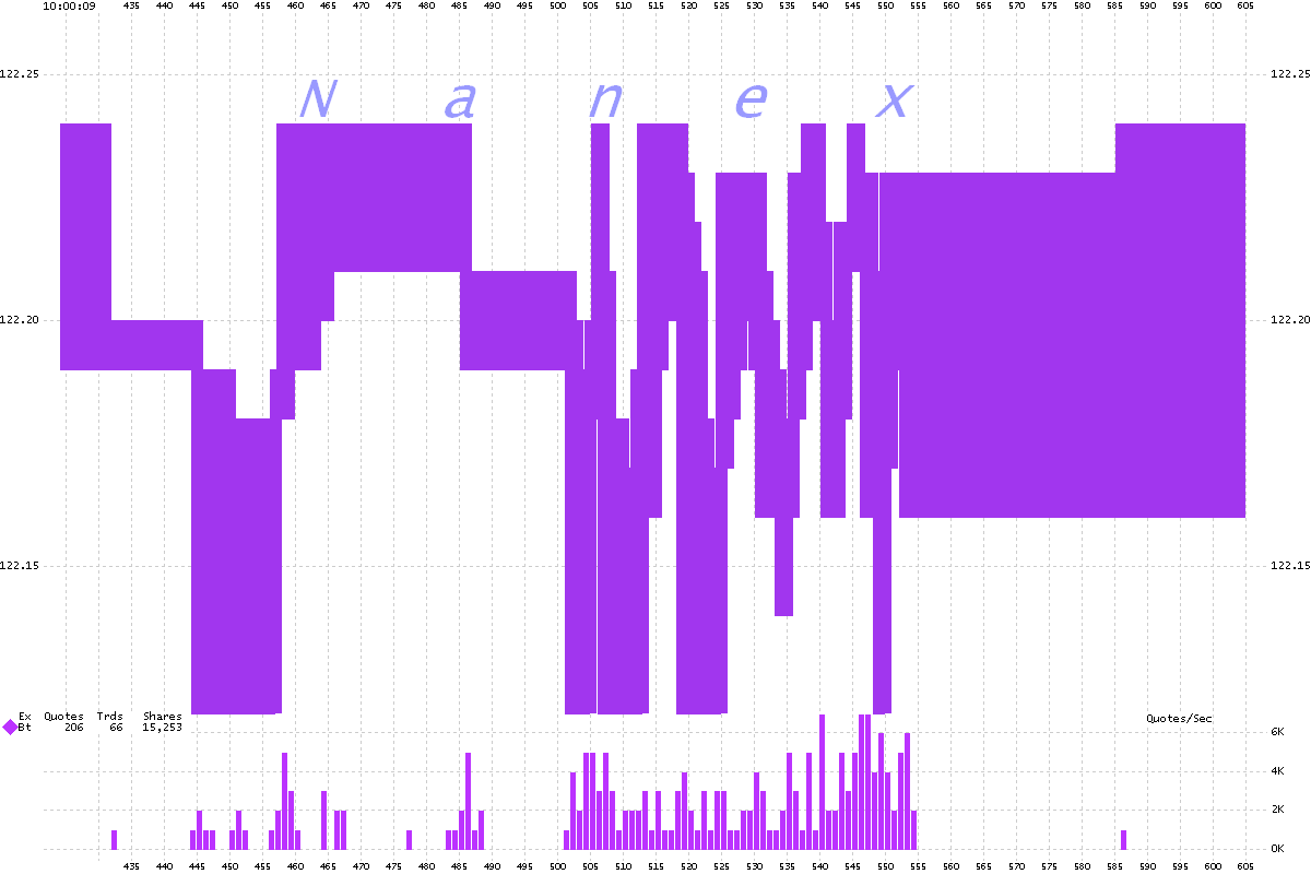
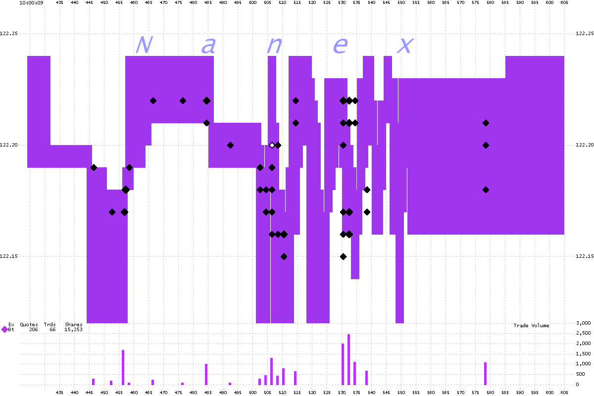
Now we will look at just the bid-ask spread from BATS, zooming in through the same
sequence as the charts above. These
charts align in time with set a above.
1b. 100 ms Interval Chart

2b. 25 ms Interval Chart

3b. 5 ms Interval Chart

4b. 1 ms Interval Chart

5b. 1 ms (Zoom 2) Interval Chart

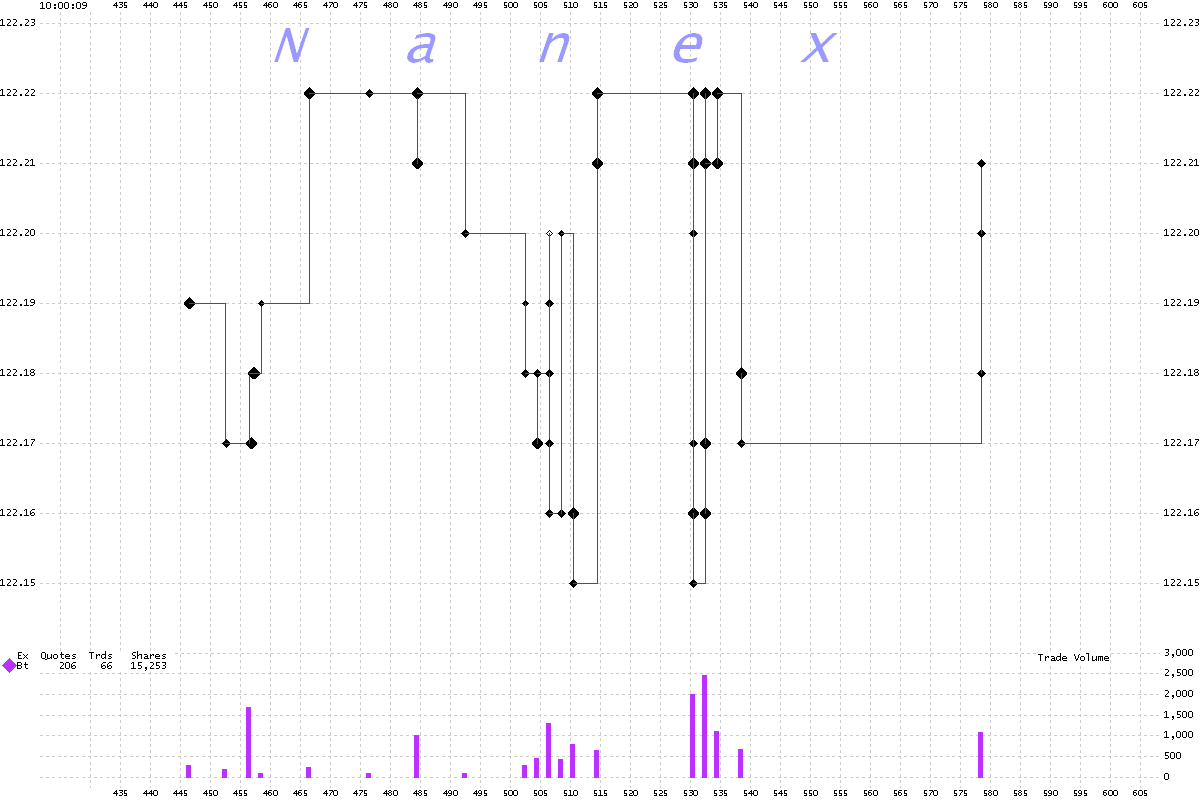
6b. 1 ms (Zoom 2) Interval Chart
Shows trades from BATS (black diamonds)..

7b. 1 ms (Zoom 2) Interval Chart
Shows just trades from bats. By connecting the trades we can get a better idea of
when they actually occurred. Trades are disseminated on a different feed (CTA) than
quotes (CQS) and each feed has its own queuing and time-stamp mechanism.

Nanex Research

