Nanex Research

Nanex ~ 15-May-2012 ~ Who do you think you are fooling?
From High-Speed Trading: Profit—and Danger—in Milliseconds (2nd page):
Not everybody sees high speed trading as dangerous, of course. CNBC spoke to Jim Oberdhal, a vice president at NERA Economic Consulting, who argued that high frequency trades are an important tool for professional traders.
“I think the bottom line argument on the benefits of high-frequency trading: it’s a risk management tool for professional traders,” Oberdhal said. “It allows them to quickly revise their quote and offer better quotes because they’re able to manage the risk of being picked off by better-informed trader sort readers with superior information about order flow or market moving news.”
We think there is a world of difference between the occasional need to revise a
quote in 1/1000th of a second vs. revising quotes 1,000 times every second. The
former makes economic sense, the latter is just plain criminal.
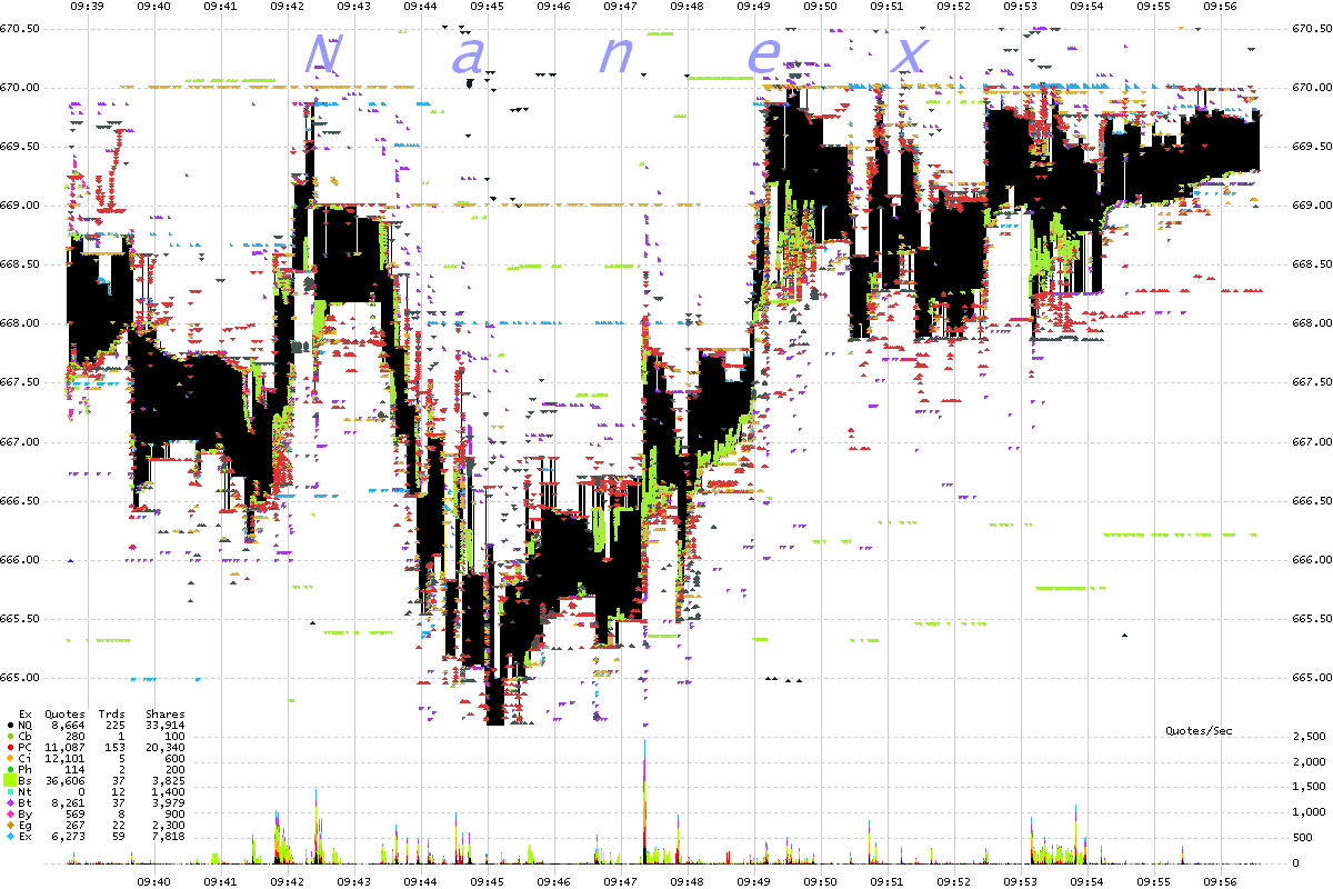
Let's use real market data that is current to unmask this charade. From 15-May-2012,
in Price Line PCLN.
One second interval chart showing bids and asks color coded by exchange.
Chart shows 18 minutes of trading.
See all those colored triangles scattered everywhere like bees? Those are actual quotes
from all exchanges in PCLN. Note the prices are all over the place in a $5 range.
There
must have been hundreds if not thousands of news events which required HFT to
quickly revise their quotes before being picked off. Not sure how you could
call them better quotes. At least Joke Quotes ryhmes.

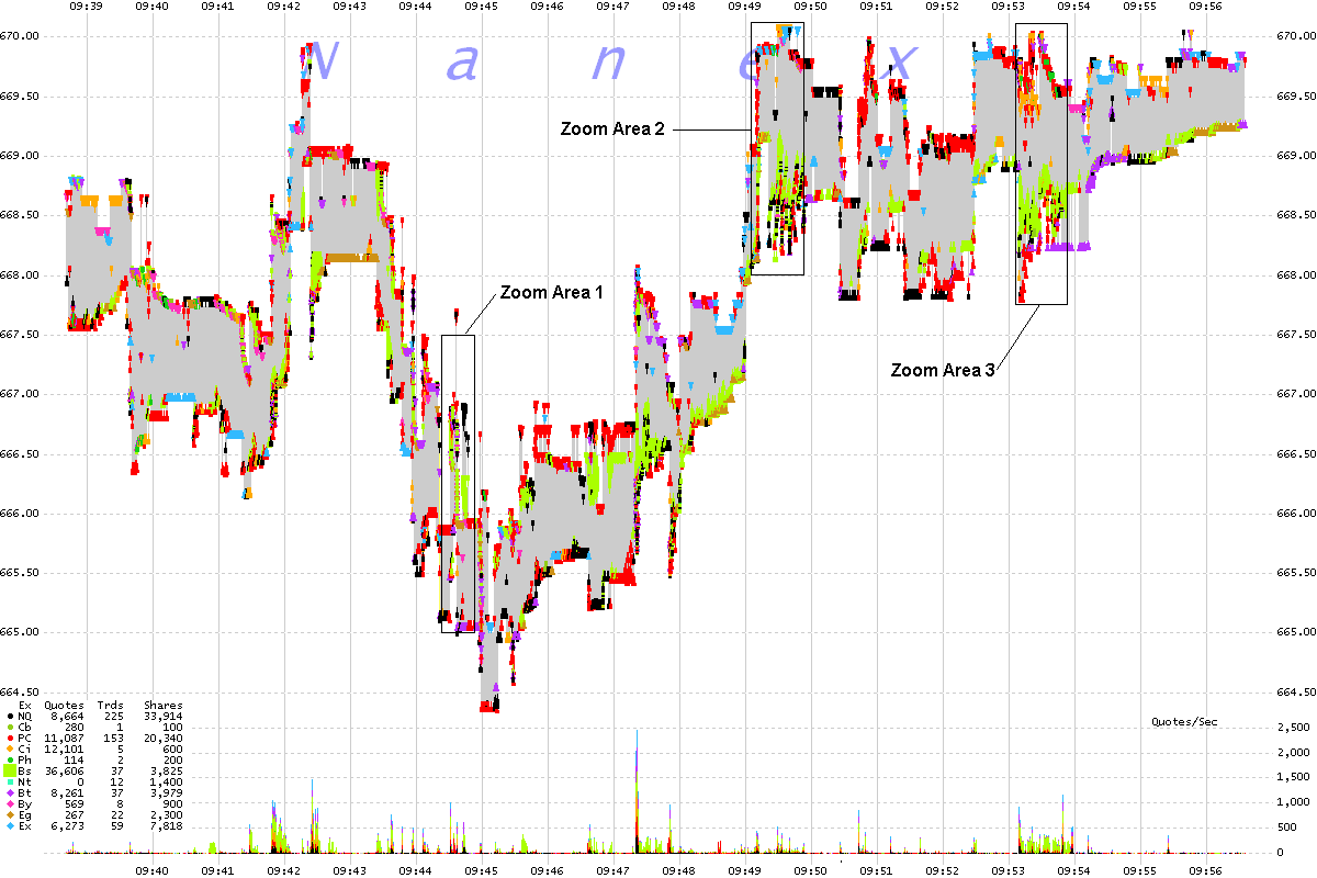
One second interval chart showing best bid and ask color coded by exchange.
Chart shows 18 minutes of trading.
We cleaned up the top chart and now show just the National Best Bids and Asks. Prices
are still all over the chart and out of control. The next 3 charts will drill down
into Zoom Area 1. Then we will drill down into Zoom Area 2 and
3.

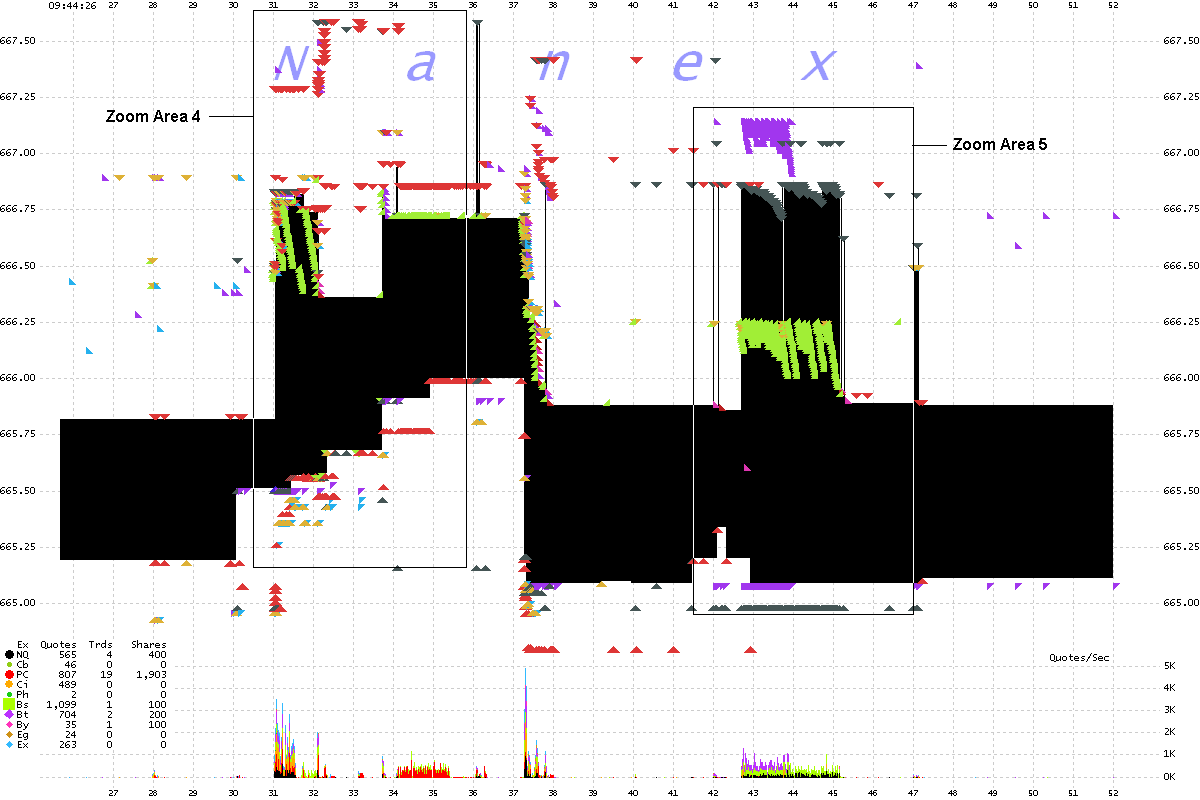
Zoom Area 1 from chart above. 25 millisecond interval chart showing all bids
and asks color coded by exchange. Chart shows 28 seconds of data.
We are going to zoom in one more step (to Area 4 and 5), because there is still too
much information.

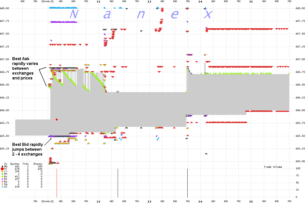
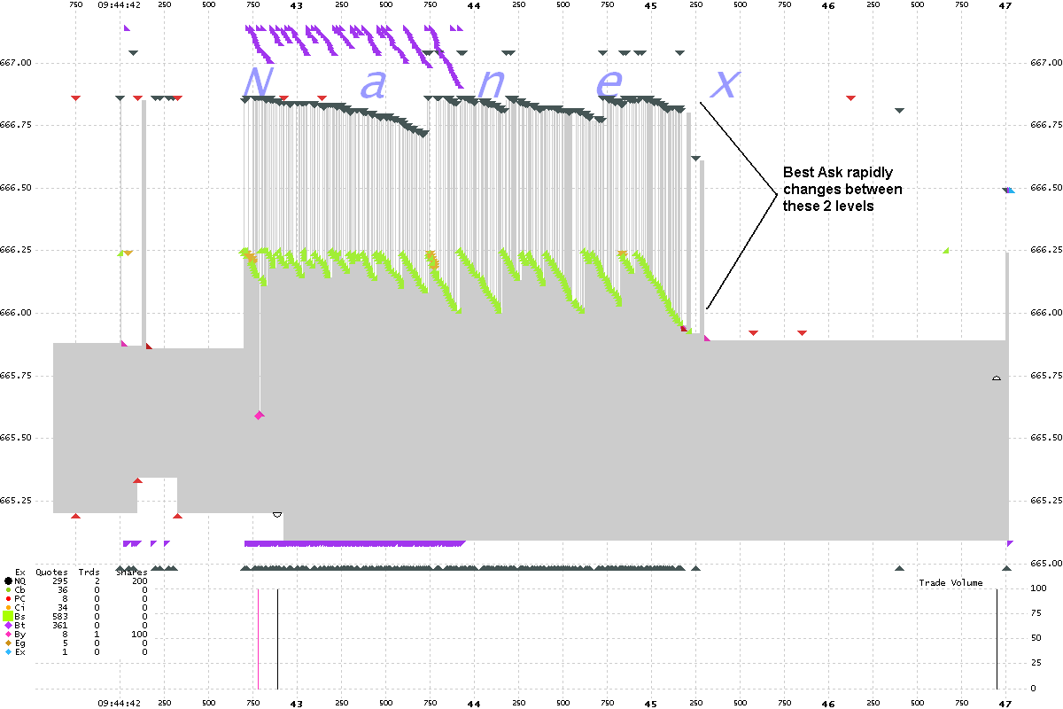
Zoom Area 4 from chart above. 5 millisecond interval chart showing all
bids and asks color coded by exchange. Chart shows about 5 seconds of data.
Note the hundreds of triangles still jammed together, even at this high zoom. There
sure must have been a lot news (there was none) requiring HFT to quickly revise their quotes before
being picked off. If you look closely, you will find only 3 trades executed.
There are 1,914 quote changes. That's a lot of better quotes alright
- or maybe Jim Oberdhal doesn't understand what is really happening. Or doesn't want
you to understand. There is a slight chance that many HFTs are not
fully aware of the relationship between quote spam and increased profitability, as
a "genetic" algo could have discovered this on its own. But after nearly 2 years of
investigating this, we are convinced it's premeditated and this behavior isn't by
accident or some "glitch".

Zoom Area 5 from chart above. 5 millisecond interval chart showing all
bids and asks color coded by exchange. Chart shows about 5 seconds of data.
Wow, just wow. You'd have to be blind not to see this outright manipulative behavior.
Where are the better quotes that Jim Oberdhal tells us HFT is providing here?
1,301 quotes and 3 trades.

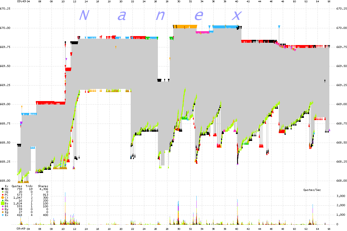
Zoom Area 2 from chart near top. 50 millisecond interval chart showing
all National Best Bids and Asks color coded by exchange. Chart shows about 52 seconds of data.
These quote changes are a sham. Yes, some improve the price, but many do not. And
those that improve prices will only disappear as fast as they appeared.

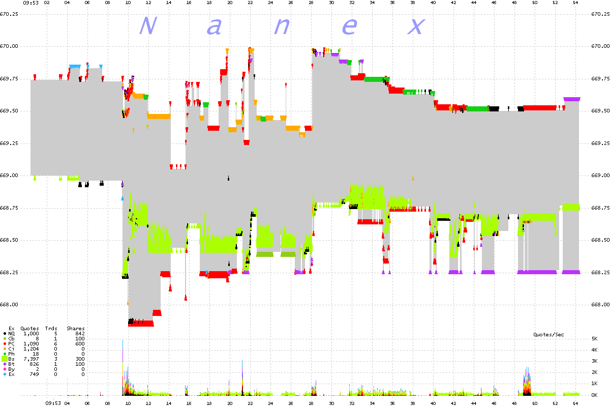
Zoom Area 3 from chart near top. 50 millisecond interval chart showing
all National Best Bids and Asks color coded by exchange. Chart shows about 52 seconds of data.
Take a good long look at the thousands of worthless quotes from just Nasdaq-Boston (light green clusters):
7,397 quotes and 3 trades. If everyone did this, it would
be lights out, as every quote feed would saturate and start falling behind.

One second interval chart showing all National Best Bids and Asks color coded
by exchange. Chart shows about 18 minutes of trading.
This is a continuation of the first chart. The non-sense continues.

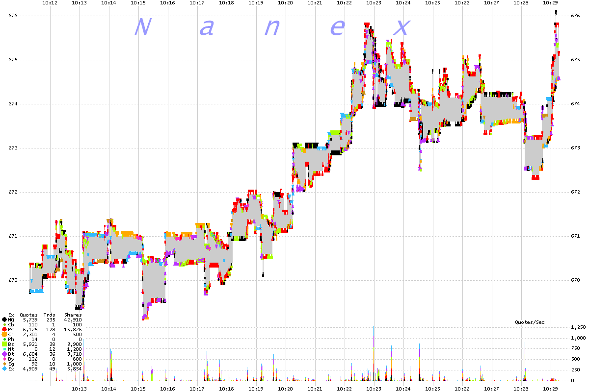
One second interval chart showing all National Best Bids and Asks color coded
by exchange. Chart shows about 18 minutes of trading.
This is a continuation of the chart above. It's like this all day.

Nanex Research

