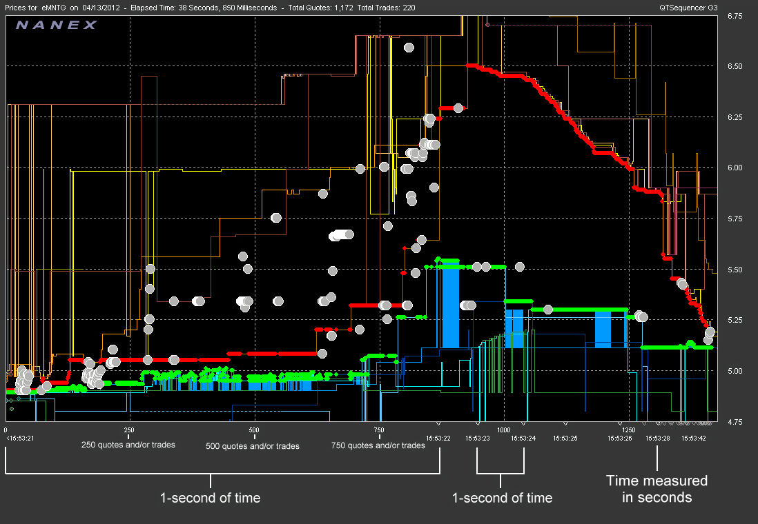
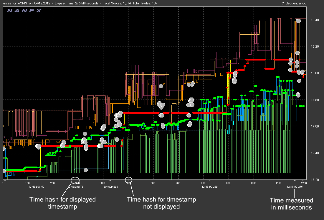
The most noticeable difference with the QT Sequencer and other familiar types of stock charting is that time becomes non-linear. That is to say, one unit of displayed time in one area of the chart (on the x-axis) may not take up the same display space as the same unit of time in another area of the chart. Only the count of quotes and trades being plotted is linear (and is displayed on the chart timeline as well).
The main components of the Timeline are:
- Quote and/or Trade counts - The running count of quotes and/or
trades plotted in the display area. Vertical grid lines in the price display
correspond to the running quote/trade count.
- Timestamps - Timestamps represent the exchange time quotes/trades
were reported.
- Timestamp hash marks - The Timestamp hash marks represent a unit of time that has passed on the display. Because the timeline is non-linear, equal spacing of the timestamp is not possible. As such, not all hash marks correspond to an actual displayed timestamp. Bright hash marks indicate the time is represented by the actual timestamp underneath the hash mark. A dark hash mark represents a unit of time that passed but could whose actual timestamp could not be displayed.

The following chart is a good example of the non-linear time plotting. Notice that more that 1/2 the chart is occupied with data contained within a 1 second period. However, seconds that follow have far fewer quotes/trades and therefore take up much less display spacing. This chart displays time hash marks and timestamps in 1 second increments:

In the next chart, time hash marks and timestamps represent 25 milliseconds of elapsed time. Note that the first three timestamps increment in 25 millisecond intervals, but that the fourth timestamp is 50 milliseconds from the last displayed timestamp. However, in-between these two time stamps is a darker hash mark. As it is so close to the previous time interval, there is not enough room to properly display the actual timestamp, so only the hash mark is shown.

