Ever wonder what "liquidity drying up" looks like? With the new Nx3D tool here at Nanex, we can see what happens to the "depth" before a major news announcement.
We have written up extensively about this phenomenon in the the past here:
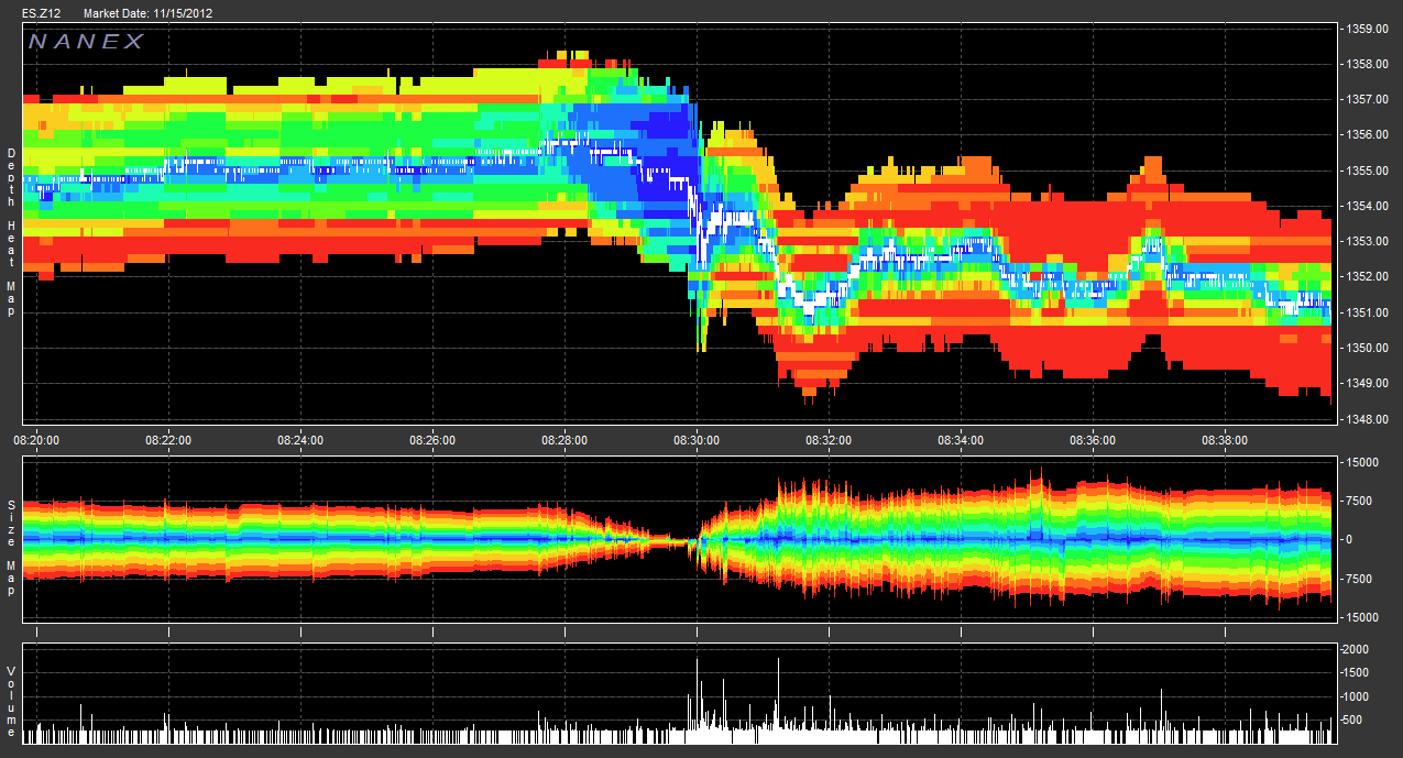
Here is one of our standard 2D Depth Map charts showing the CPI announcement at 8:30AM ET on 15-Nov-2012:

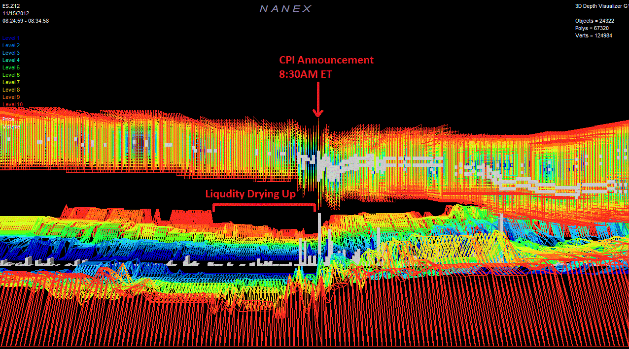
Here is a similar image taken of the same time period, but showing the actual "depth" in three dimensions. Notice how there is a sizable drop in almost all levels right before the announcement?

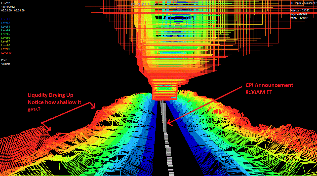
This is the same event, but taken from a view along the price/volume axis so you can see the two sets of depth on either size. Again you can see how shallow it gets before the announcement, and then BOOM liquidity springs right back up.

But we here at Nanex don't stop with still images! Below is a video that walks you through along the price/volume axis and also from the side so you can witness the phenomenon in all of its Nx3D glory.
