Nanex Research

Updates to this Page

Date Time (EDT) Update
03-Aug-2012 10:00pm The Knightmare Explained - why it took so long for them to detect the problem.
07-Aug-2012 11:15am We added 375 New Charts here.
08-Aug-2012 10:00am Video of a hot-list quote screen showing the Knight algo in action.
09-Aug-2012 18:30am Added table showing Impact of Knight onTrading Volume.
10-Aug-2012 10:20am Added chart showing Impact of Knight on Sub-Penny Trading.
13-Aug-2012 07:00am Nanex tweets during this event

Nanex ~ 01-Aug-2012 ~ Knightmare on Wall Street

What Really Happened, or How to Test Your New Market Making Software and Lose a Pile of Money, Fast

On August 1, 2012, starting at market open (9:30 EDT), our monitoring software alarms went off on hundreds of symbols. Looking closer at the data, we found and reported (at 9:38am) that many NYSE stocks had extremely high trade rates: several sustaining over 100 trades per second.

What follows should strike you as crazy. If it doesn't, read it again, because it is.

The following 3 charts plot non-ISO trades (regular trade condition) reported from NYSE in the stock of Exelon Corporation (symbol EXC). By plotting and connecting only regular trades from NYSE we get a clearer picture of the nature (some might say horror) of this event.

1. EXC One second interval chart. Circles are trades, the blue coloring is the NYSE bid and ask which is mostly covered by gray lines that connect the trades.


If we zoom in and look at what happens under one second, then a clear pattern emerges. We think it's important to note that the SEC claimed there is no value to be gained from looking at data in time resolutions under a second "because it is just noise". We strongly disagree.

2. A 25 millisecond interval chart that zooms into a 27 second period of the chart above. Now the gray lines connecting trades are more clearly visible. NYSE's bid/ask is the blue shaded area (the bid price is the bottom of the shading, and the ask is the top).


The next 2 charts illustrate trade executions that ping-pong between hitting the ask and hitting the bid. As if someone is buying at the offer and then, almost immediately, selling at the bid, then buying at the offer, then selling at the bid and so forth. It turns out, the gray shading you see in charts above are the zig-zag lines connecting the alternating buy and sell executions. That's right, almost all these trades alternate between buying at the offer and selling at the bid, which means losing the difference in price. In the case of EXC, that means losing about 15 cents on every pair of trades. Do that 40 times a second, 2400 times a minute, and you now have a system that's very efficient at burning money.

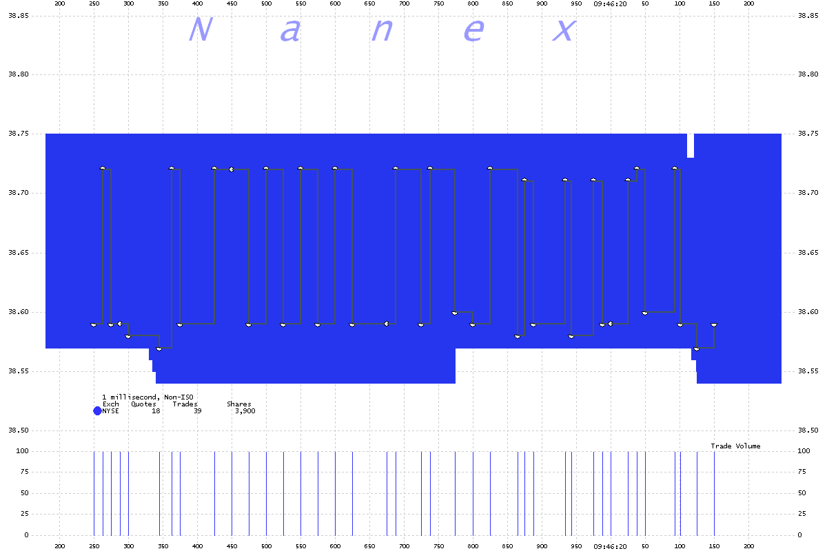
3. Zooming in to a 1 millisecond interval chart, we can see one second of data which shows 39 trades.


4. A 25 millisecond interval chart of Nokia (NOK) showing the same pattern as above.  Note: this chart shows bids and offers from NYSE as blue triangles instead of shading. There are so many trades that they appear as a coiling black mass. In Nokia, the trade rate was a steady 200 per second for many minutes.


Wall Street is very good at minting money, but burning money? For 30 minutes? More likely, for some of the stocks, such as EXC and NOK the same firm was on both sides of each trade and were simply testing out new market making software. After all, the NYSE started their new Retail Liquidity Price Improvement Program the very same day, and only NYSE listed stocks were involved in this event. Also note that many of the trade executions are inside the bid/ask; something very unusual for trades and quotes from NYSE. Also, virtually all these trades are for 100 shares - the minimum number required to be reported in the system. And the timing of the trades is very evenly spaced, too evenly spaced. And many examples show a buy and sell appearing at virtually the same time, so close that the second trade has the very next exchange sequence number. Furthermore, the bid/ask spread remains very stable during this rapid buying and selling. Had these been real orders, the bid/ask spread would have quickly widened.

If this is true, then this firm would not have incurred any trading losses. They would have just ended up painting the tape. With a fire-hose.
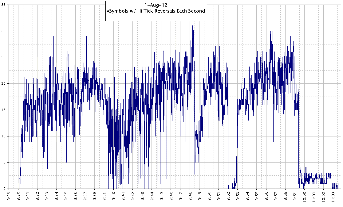
This would explain several unsolved mysteries that we've reported in the past.

Below is a chart showing how many symbols exhibited this ping-pong behavior (wash sales) for each second from the open until the problem appeared completely resolved.


At the same time, charts of other stocks clearly indicate this firm trading with others: this is likely the source of huge trading losses. Take the chart of the stock CODE below. The trading rate abruptly vanished 3 times, at points labelled A, B, and C. This is  likely an attempt by someone to halt the algo. At each of these times, the price popped up, as if a great weight were being lifted. The 2nd chart below shows this more clearly.

6. CODE - 5 second interval chart showing all trades color coded by exchange.


7. Zoom of above, but showing non-ISO (regular) trades only.
Note the solid wall of blue dots (trades from NYSE) holding prices down.


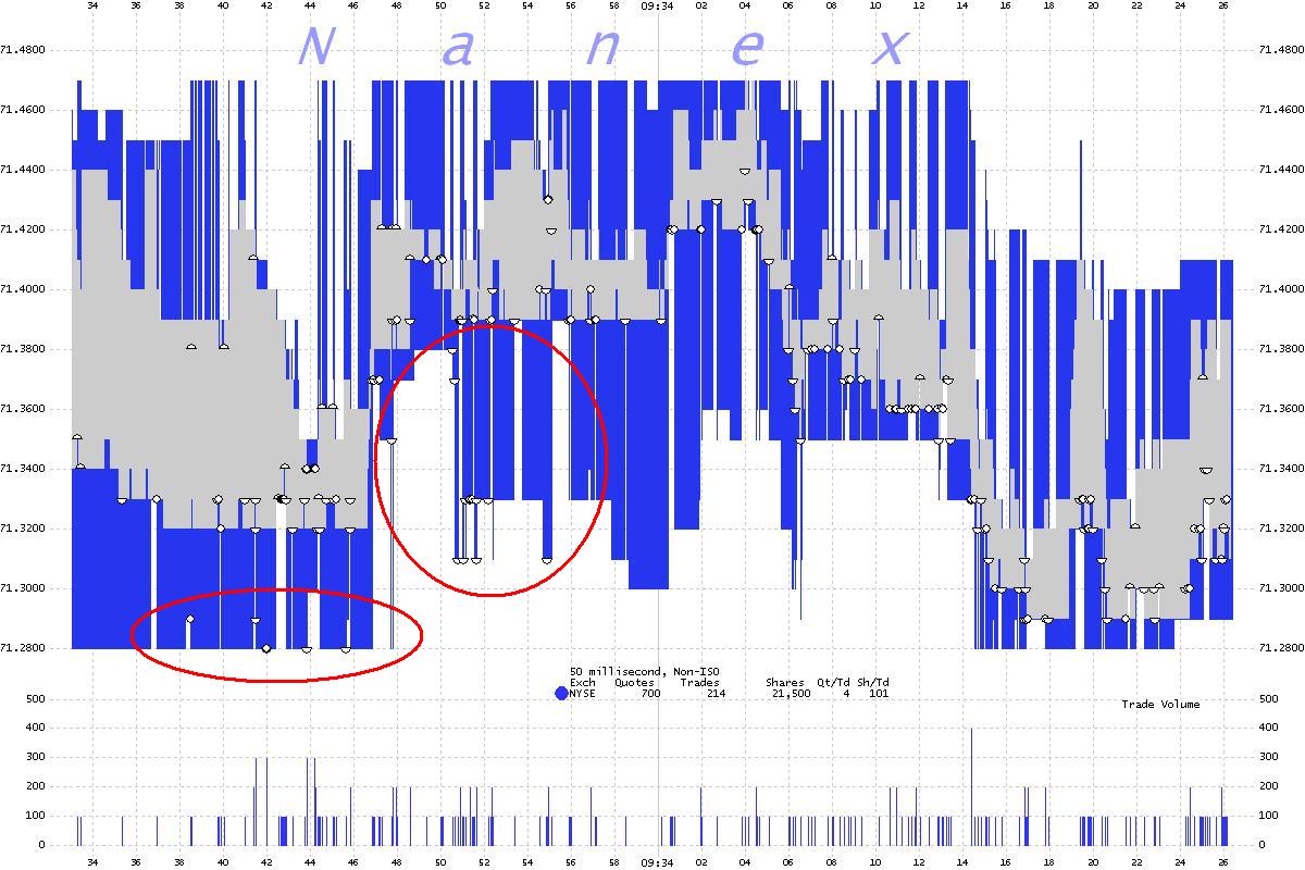
There are many examples of trades executed at NYSE at prices equal to the NYSE bid or offer, but outside the best bid or offer. One such example is shown in the chart below of Pepsi (PEP). Circled in red are the trades that executed at NYSE at prices equal to NYSE bids but lower than the best bid. The blue shading is the NYSE bid/ask spread. The gray shading is the NBBO.

8. PEP - 50 millisecond interval chart showing NYSE bid/ask spread in blue, the NBBO in gray and non-ISO trades executed at NYSE.


List of affected symbols showing #Trades, Volume, and High, Low, Last data.
We snapped the top 500 stocks with the highest number of trades at 9:59:45 and then removed those that don't appear to have been affected. For reference, we included SPY because it almost always has the highest number of trades. It is #52 in this list, which means an unprecedented 51 other stocks had more trades than SPY at 9:59:45.


Download the full list.

Impact of Knight on Trading Volume

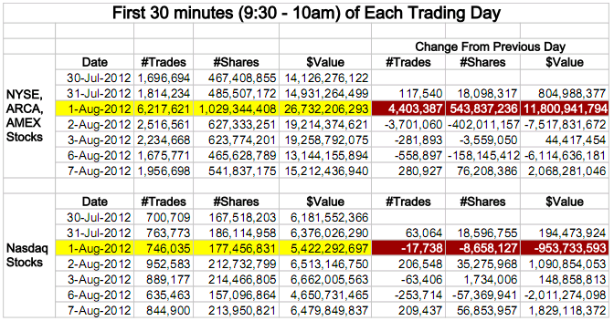
We summed the number of trades, shares, and total value of trades for the first 30 minutes of each trading day between July 30, 2012 and August 7, 2012. By separating these counts into 2 groups: NYSE, ARCA, and AMEX listed stocks (where Knight was active) and Nasdaq listed stocks (where Knight was not active), we immediately spot a big difference. For the first group, there were an additional 4.4 million trades, 544 million shares, and $11.8 billion in value more than the previous trading day. Contrast that with the second group actually have fewer trades, shares and value of stock traded. Not only did Knight cause significantly higher volume for NYSE, AMEX and ARCA issues, but it also sucked interest away from Nasdaq issues.


Impact of Knight on Sub-Penny Trading

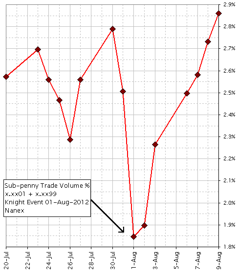
The chart below shows the percentage of shares with trade executions priced in sub-pennies 1/100th of a cent away from the nearest whole cent. We look for trade execution prices that require 4 decimal places with the final 2 digits ending in 01 or 99. For example, 43.2599 or 22.5701. Note the sharp drop in the percentage of shares that executed at these prices on August 1, 2012, which quickly recovered a few days later. More on sub-penny trading here and here. There is also this study of sub-penny trading in Apple at 1 and 99 hundredths of a penny. Maybe investors were better off without this nonsensical price improvement benefit.


53 selected Nanex Tick Charts of this event


The following 6 charts are 1 second interval charts of symbol VPU

1. Showing all trades color coded by reporting exchange.


2. Showing only ISO trades color coded by reporting exchange.
Trades with the ISO condition result from Intermarket Sweep Orders which can only be used by firms directly connected to exchanges. It is an indication of HFT


3. Excluding ISO trades. Note how nearly all of these trades are from NYSE-ARCA and are mostly 100 shares.


4. Showing best bids and offers color coded by exchange.


5. Showing all bids and offers color coded by exchange.


How to read Nanex Tick Charts

Nanex Research

Inquiries: pr@nanex.net