Nanex Research

Nanex ~ 26-Oct-2012 ~ Apple Breaks $600
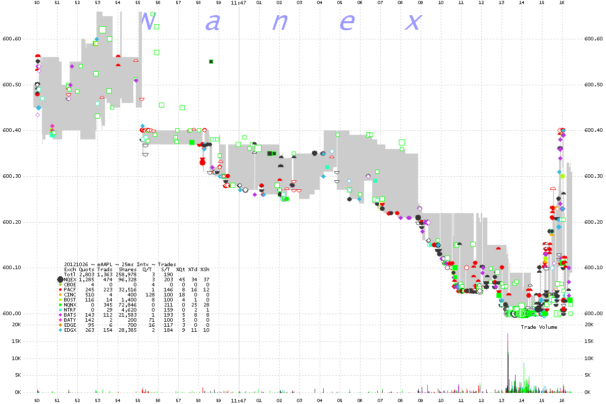
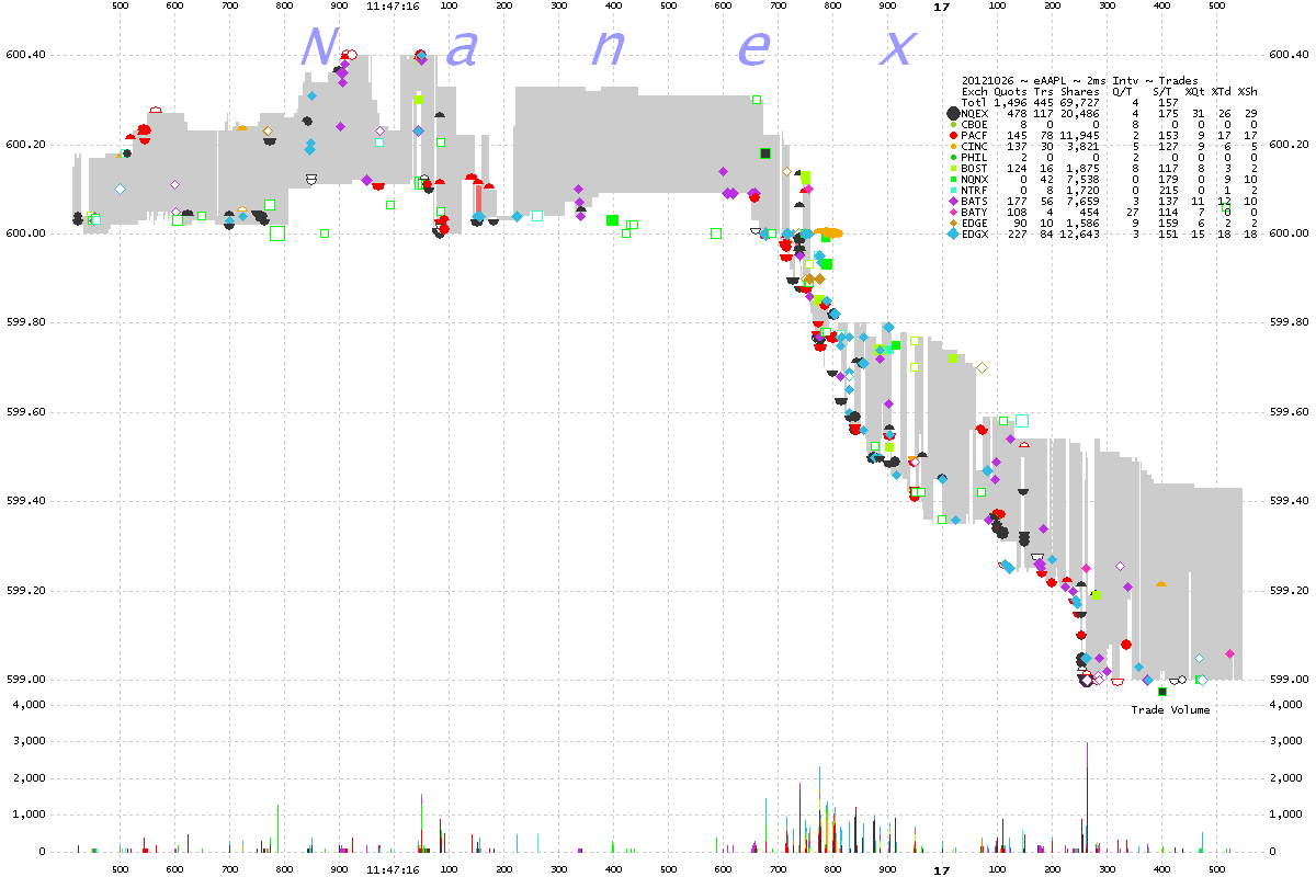
On October 26, 2012 at 11:47:16 Apple broke through $600 during regular trading hours.
We noticed a familiar
oscillation pattern just before the drop.
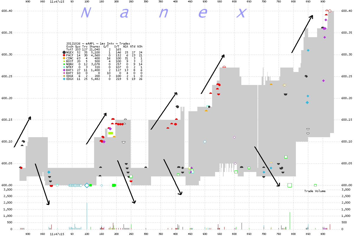
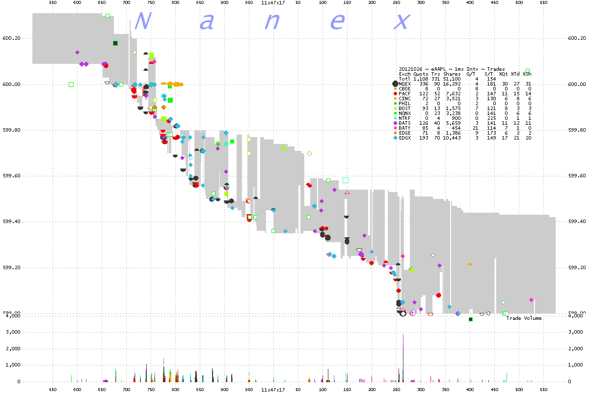
1. AAPL 1 millisecond interval chart showing trades color coded by exchange.
Gray shade is NBBO. Chart shows 1 second of data.
The arrows shows an oscillation occurring just before Apple drops below $600.
Here's an interesting observation:
- The trades near the best ask price (top of gray shading) are from buyers.
- The trades near the best bid price (bottom of gray shading) are from sellers.
- Buy and sell trades take place within milliseconds of each other.
- If the buyers and the sellers simply traded with each other, each side would save
1/2 the bid/ask spread - which ranges from 4 to 36 cents per share!
- Why does this always happen in highly liquid stocks like Apple?

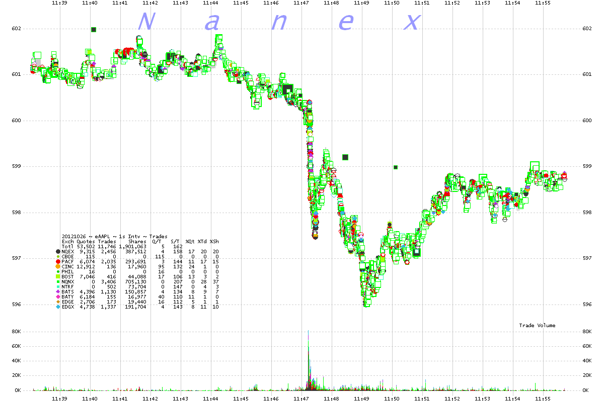
2. AAPL 1 second interval chart showing trades color coded by exchange

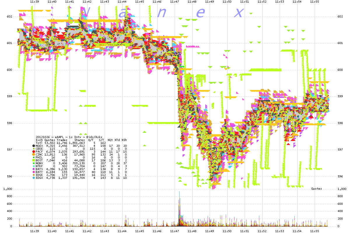
3. AAPL 1 second interval chart showing bids and asks color coded by exchange.
Boston quotes (green) show a familiar claw pattern.

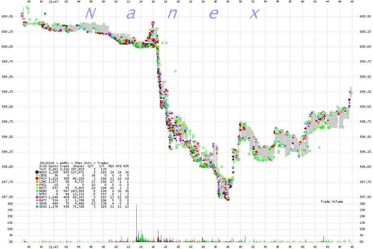
4. AAPL 50 millisecond interval chart showing trades color coded by exchange.
Zooming in.

5. AAPL 25 millisecond interval chart showing trades color coded by exchange.
Approaching $600, just before the drop.

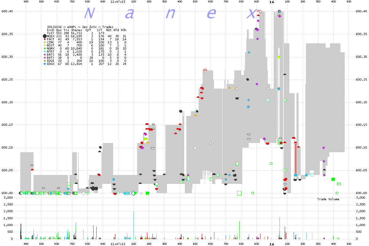
6. AAPL 2 millisecond interval chart showing trades color coded by exchange.
Chart shows 2 seconds of data.
Just before the drop.

7. AAPL 2 millisecond interval chart showing trades color coded by exchange.
Chart shows 2 seconds of data.
Breaking $600

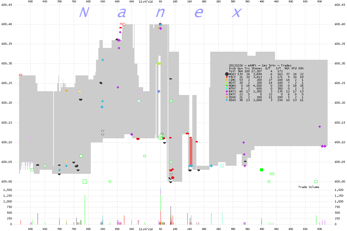
8. AAPL 1 millisecond interval chart showing trades color coded by exchange.
Chart shows 1 second of data.
Zooming closer before the drop.

9. AAPL 1 millisecond interval chart showing trades color coded by exchange.
Chart shows 1 second of data.
Zooming into the drop.

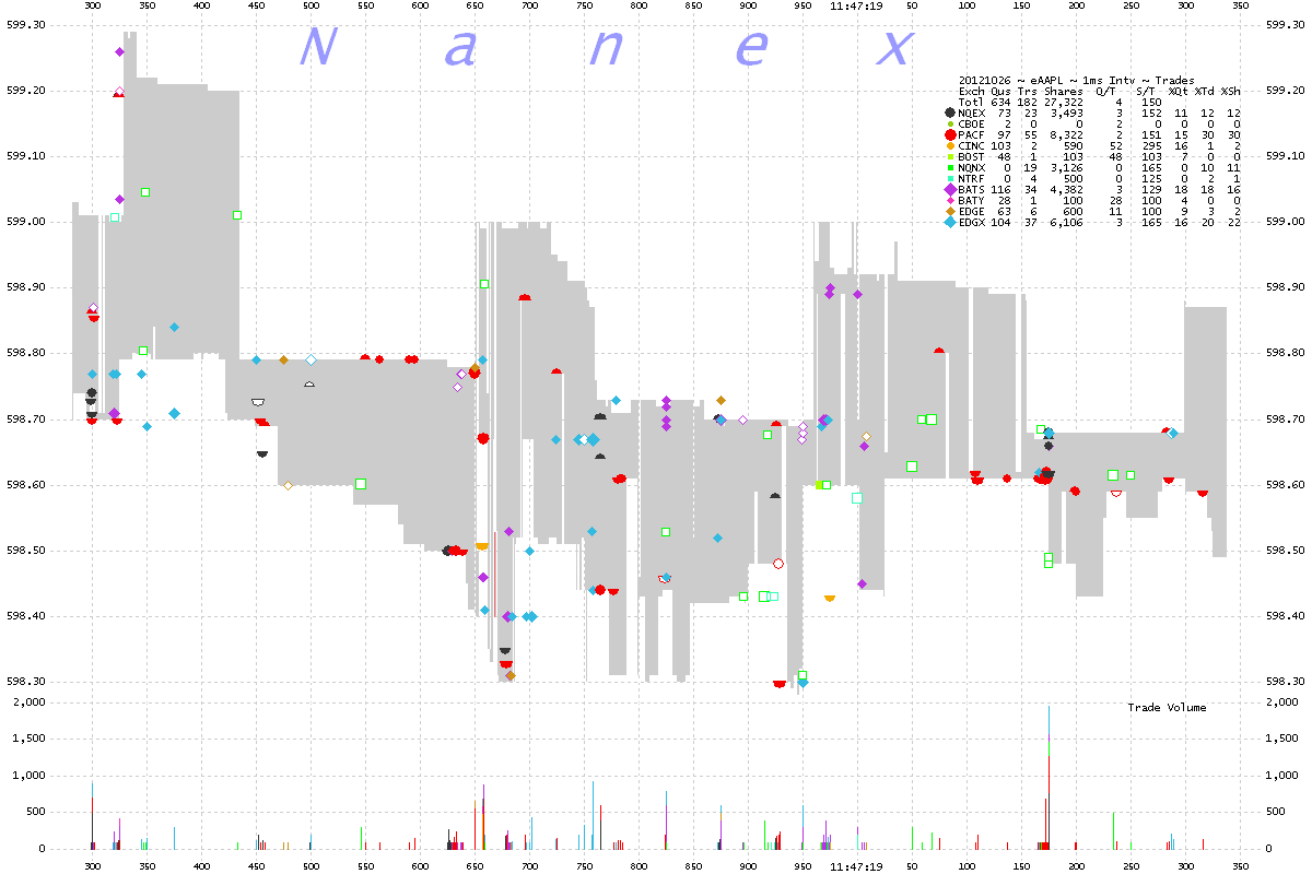
10. AAPL 1 millisecond interval chart showing trades color coded by exchange

Nanex Research
Inquiries: pr@nanex.net

