Nanex Research

Nanex ~ 10-May-2013 ~ The Amgen Wobble
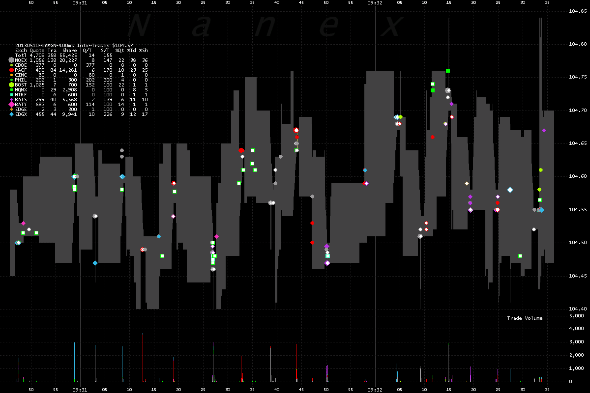
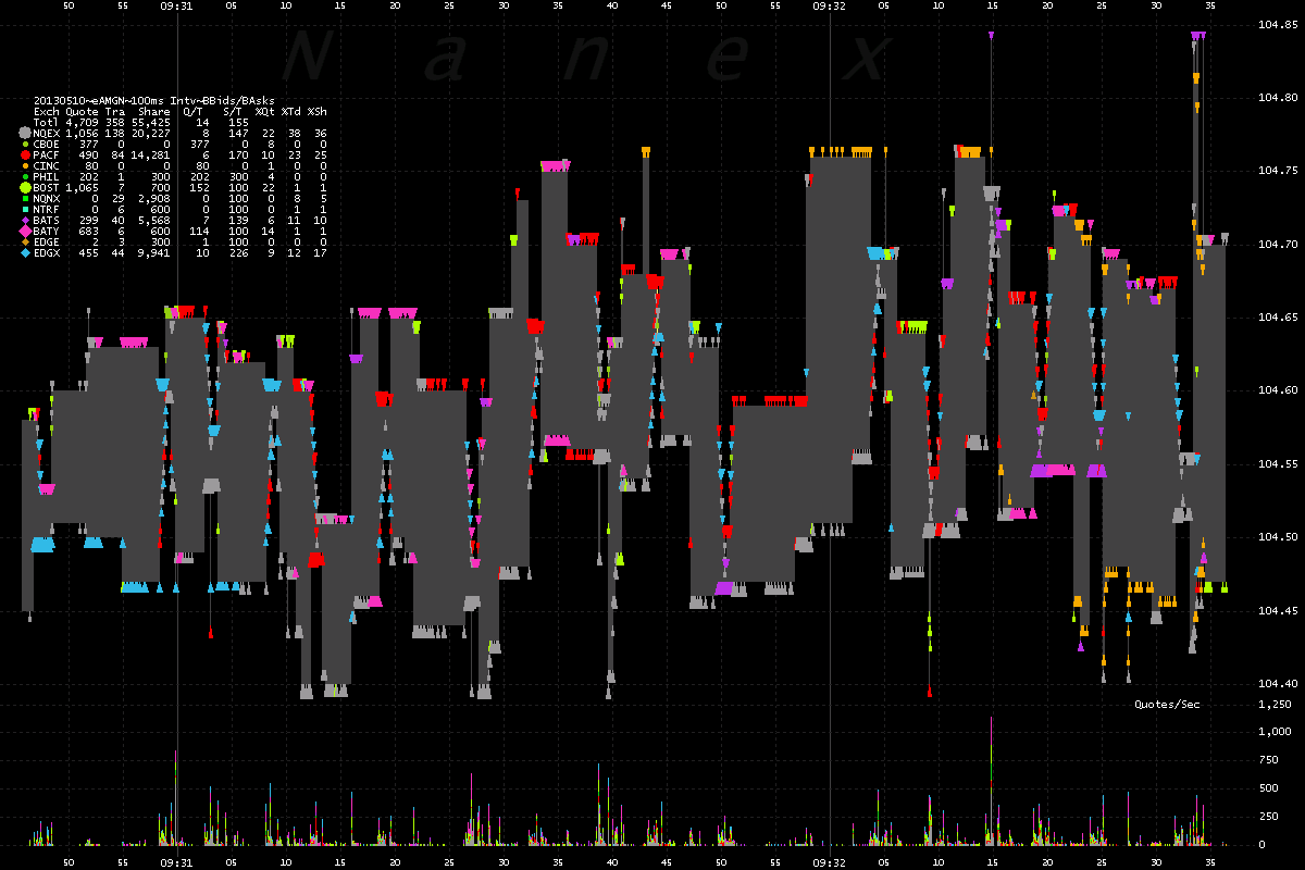
Take a good look at the charts below. The first 2 show trading in the stock of Amgen
(AMGN) over the same 3 minutes of time. Chart
1 shows trades, while chart 2 shows best bids/asks. The light gray shading is the NBBO spread
(National Best Bid/Offer) - the top of the shading is the best ask (lowest selling price
from any exchange), and the bottom of the shading is the best bid (highest buying price
from any exchange). Note
how the NBBO oscillates over a range of 25 cent or more. Somehow we doubt investors
are buying at the lower prices or selling at the higher prices. Probably the other way
around.
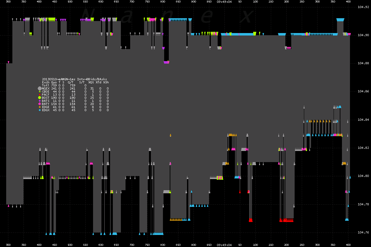
Chart 3 and 4 shows how difficult it is to measure spreads - a key metric HFT (high
frequency trading) claims to improve. The way most academics measure it, they would tell you the spread
is a few pennies - because they tend
to aggregate data over longer
periods of time and not look at it closely.
This is why there is such a discrepancy between what we publish from
real world observations and what academics (most of whom are
paid by the HFT lobby) see from their
ivory towers.
These charts were used in a
Business Insider article.
1. AMGN - Trades color coded by reporting exchange.

2. AMGN - Showing Best bids and offers color coded by exchange over the same
time period as chart 1 above.
Not only does price change rapidly, but also the exchange where the best prices are.

3. AMGN - Showing Best bids and offers color coded by exchange over 1 second
of time.
Behold how often the quote changes in 1 second. No trades executed during this time.
This nonsense goes on all the time.

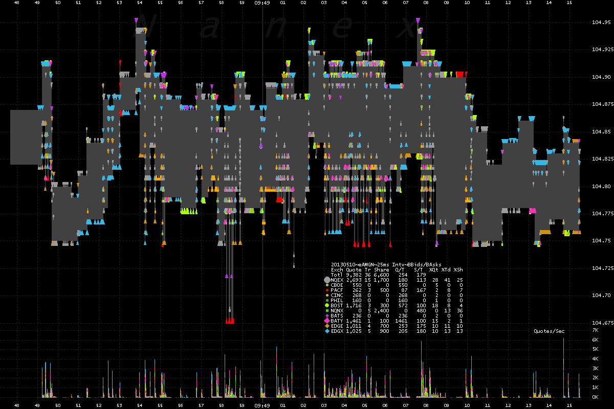
4. AMGN - Showing Best bids and offers color coded by exchange over 27 seconds
of time. This is a zoomed out view of chart 3 above.
Note how often, and by how much the best bid/offer changes. No wonder smart
order routers get confused.

Nanex Research
Inquiries: pr@nanex.net

