Nanex Research

Nanex ~ 27-Jun-2013 ~ Reg NMS and QQQQ

Below are 562 charts of QQQQ  on October 10, 2008. These charts supplement those shown on this page. Each chart shows about 1 minute of time. Note, the symbol QQQQ was changed to QQQ on March 23, 2011.

Each chart plots trades and quote spreads from Nasdaq and PACF (NY-ARCA) exchanges. The NBBO, when crossed, is shown in red. Note that PACF's quote (blue) often mirrors Nasdaq's quote (gray), but is shifted to the right. This is because PACF's quote was lagging far behind quotes from Nasdaq and other exchanges. Other exchanges are  not shown for clarity (charts get cluttered quickly when including all exchanges). PACF's lagging quote is the source of almost all NBBO crosses shown in the charts below. Also note that PACF's trades almost always line up with Nasdaq trades, and occur before PACF's quote! This is solid evidence that High Frequency Traders were illegally receiving core quote information before the consolidated feed, which is exactly what the NYSE was fined for in September 2012.
 
Color/Shape Item
Gray Shading Nasdaq Quote Spread
Light Blue Shading PACF Quote Spread
Dark Blue Shading Where Nasdaq's quote overlaps with PACF's quote
Red Shading Where NBBO is crossed (best bid price > best ask price)
Gray Circles Nasdaq Trades (white filled for regular, gray filled for ISO)
Blue Diamonds PACF Trades (white filled for regular, blue filled for ISO)
Green Circles Pre/Post Market Trades (Form-T)

Wherever you see red in the charts below, that's when HFT received an unfair trading advantage and front ran other traders and investors.


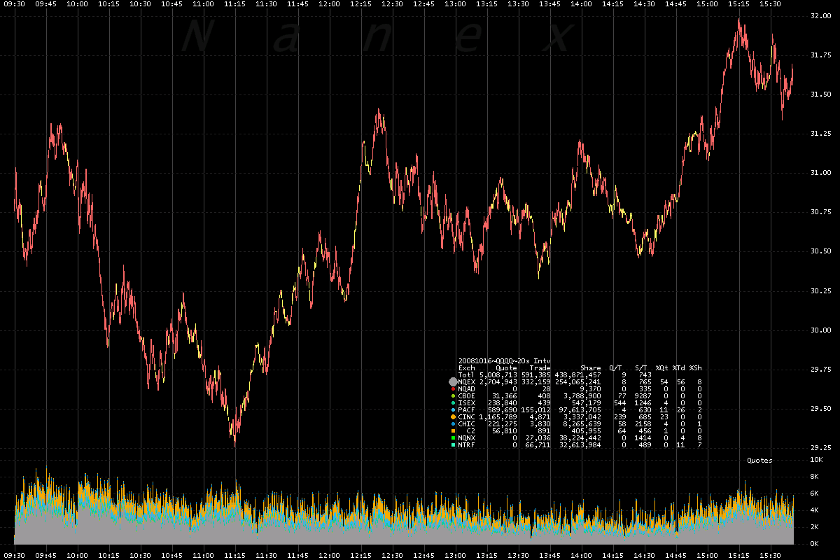
Chart showing NBBO over the entire day.
Each bar is 20 seconds and is colored red if the NBBO was crossed (bid price > ask price) during that period, yellow if locked (bid price = ask price) or gray if normal. Note how often the NBBO was crossed! 


Nanex Research

Inquiries: pr@nanex.net