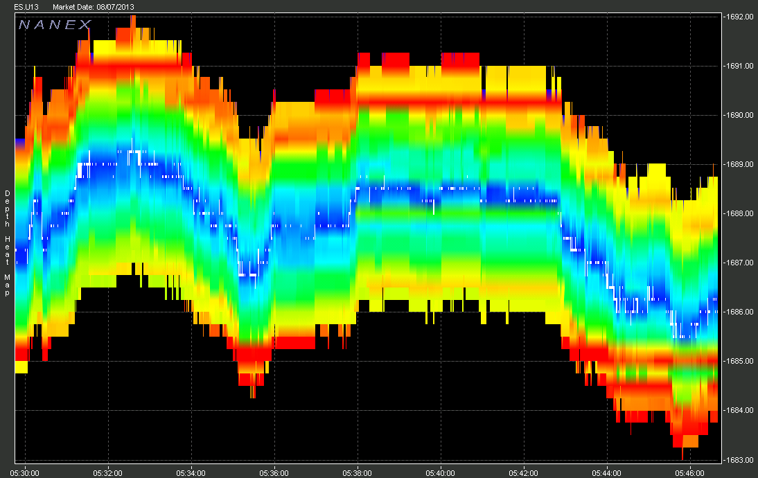
Each vertical slice (1 pixel in most of our charts) represents 1 second of time.
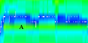
The white dots and lines running through the middle of the bands of colors show where trades executed.
There are 10 color band above and below the center. The bands above indicate the total number of contracts to sell at each respective price level, while the bands below indicated the total number of contracts to buy.
We use a rainbow coloring scheme (Red, Orange, Yellow, Green, Blue, Violet) to indicate the relative size of orders at that point in time. Red indicates a large number of contracts while violet indicates few.
For actively traded futures such as the eMini, price levels are separated by 1 tick (0.25), but can be multiple ticks in less active contracts.


