The Emperor Has No Clothes
Even HFT Proponents are Clueless about
Spreads
More
Nanex Research

Updated 3/2/2012: We created an animated GIF showing the growth (2006 -
2012) of the
NBBO Spread Ignition Events
shown in two charts at the bottom of this page.
Occasionally a new study comes out claiming HFT narrows spreads.
There are a number of questions you need to ask about these claims, such as how recent
is the data set, what is the resolution (1 second, minute or daily), how are spreads measured, and what subset of symbols were
used in the study? For example, this article
from
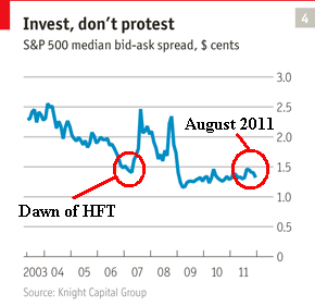
The Economist uses the following graphic supplied by a pro-HFT camp which purports
to show tighter
bid/ask spreads. Never mind the obscure explanation (or lack of) for how this one
line is calculated, you simply need to look at the dates to realize someone doesn't know
their history very well. HFT trading was born with Reg NMS in early 2007 (left circle, as we define HFT),
and shortly thereafter, spreads actually spike higher. Furthermore, spreads
are right back to where they started (right circle), but we are stuck with all
the negative HFT baggage. Remember, this image was supplied by the pro-HFT camp!
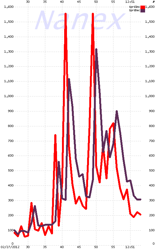
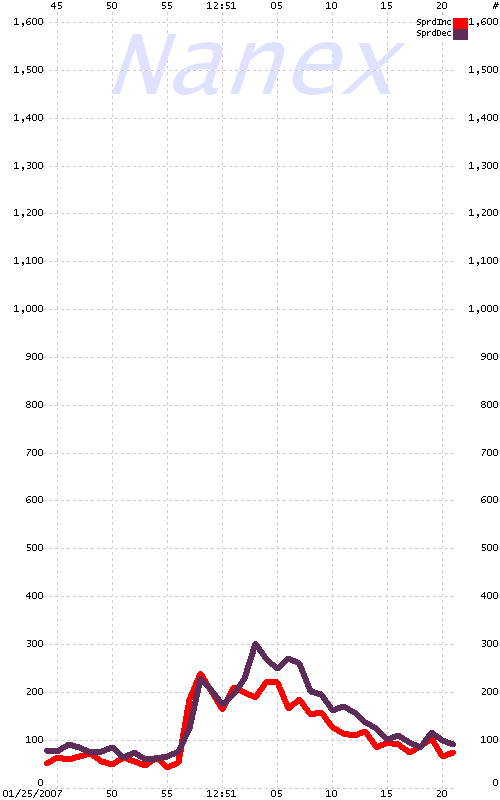
The chart below on the left illustrates one aspect of just how difficult measuring quote spreads can be. It shows the number of stocks with increasing (red) and decreasing (black) spreads
for each second for about 1 minute on February 27, 2012 around the time that market
traffic exploded with active ETFs such as SPY, IWM, QQQ, etc. experiencing
locked or crossed
markets.
Note how the red line spikes suddenly at 12:50:41, indicating almost 1,600 stocks had
increasing spreads. The very next second, the red line drops, and the black line spikes
indicating approximately 1,100 had decreasing spreads. This repeats again just 8 seconds
later. Note how every red spike is immediately followed by a black spike, and in most
cases, the red spike is higher and narrower than the black spike. This indicates the
highly volatile nature of quote spreads: where the bid/ask spread of 1,000 or more
stocks stocks can suddenly increase within a second.
The chart on the right is a randomly selected chart with a similar surge in market
activity on a day before Reg NMS (and HFT). Note the scale difference: many fewer
stocks had volatile spreads. The chart on the right is typical of spread behavior
before HFT.
See also Quote Spread Disintegration.
| February 27, 2012 |
January 25, 2007 |
More Nanex Research
