Nanex Research

Nanex ~ 26-Jul-2012 ~ Salami Slicing Sub-Penny Style

A study of 41 billion trade reports since 2006 reveals a clear winner from retail price improvement. Hint: it's not the retail trader.


Salami Slicing from Wikipedia:

Salami slicing is a series of many minor actions, often performed by clandestine means, that together results in a larger action that would be difficult or illegal to perform at once. The term is typically used pejoratively.

An example of salami slicing, also known as penny shaving, is the fraudulent practice of stealing money repeatedly in extremely small quantities, usually by taking advantage of rounding to the nearest cent (or other monetary unit) in financial transactions.


We counted all eligible trade reports from stocks listed on NYSE, ARCA, AMEX, and Nasdaq from January 3, 2006 through July 25, 2012. To be eligible, the trade price had to be greater than $2. To qualify as a sub-penny trade in this study, the price had to require more than 2 decimal places, and not be priced exactly at 1/2 cents.

See this report for more information on sub-penny trades, who benefits, who loses, and what the SEC has stated and ruled on this important topic. We also published a paper on sub-penny trades in Apple stock.


The pie chart below shows the distribution of the sub-penny trades in our study. A full 28% (red slice) of these trades had a price improvement at the lowest permissible amount: 1/100th of a cent ($0.0001) per share.

The total price improvement on a typical $10,000 stock trade is a whopping 1 penny. Who in their right mind would think this was a benefit worth touting?


The other slices show that 26% (green) of sub-penny trades had a price improvement benefit between 2/100 and 10/100ths of a cent, and 46% (blue) had a benefit between 11/100 and 49/100 of a cent.
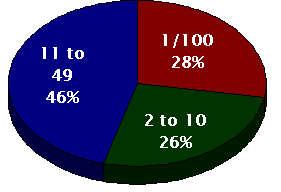
Note that over half of all price improved trades (54%) involve an economically insignificant amount (1/10th of a cent).

In the SEC's own words:

[Reg NMS] was designed to limit the ability of a market participant to gain execution priority over a competing limit order by stepping ahead by an economically insignificant amount.


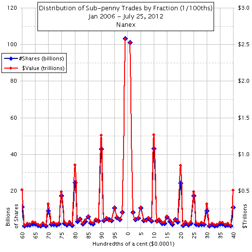
The next chart further details the distribution of sub-penny trades. The two spikes in the center represent prices with fractions of a cent of 99/100 and 1/100 -- both of which are 1/100 of a cent away from the nearest whole cent. The sum of these two spikes make up the red slice in the pie chart above.

Note how the data in the left half of the chart is a near mirror image of the data on the right half of the chart. That is because internalizers (wholesalers, those who buy orderflow from retail brokers) give buyers the same price improvement they give sellers. Also note that the left scale is in billions of shares, and the right scale is in trillions (yes, trillions) of dollars.
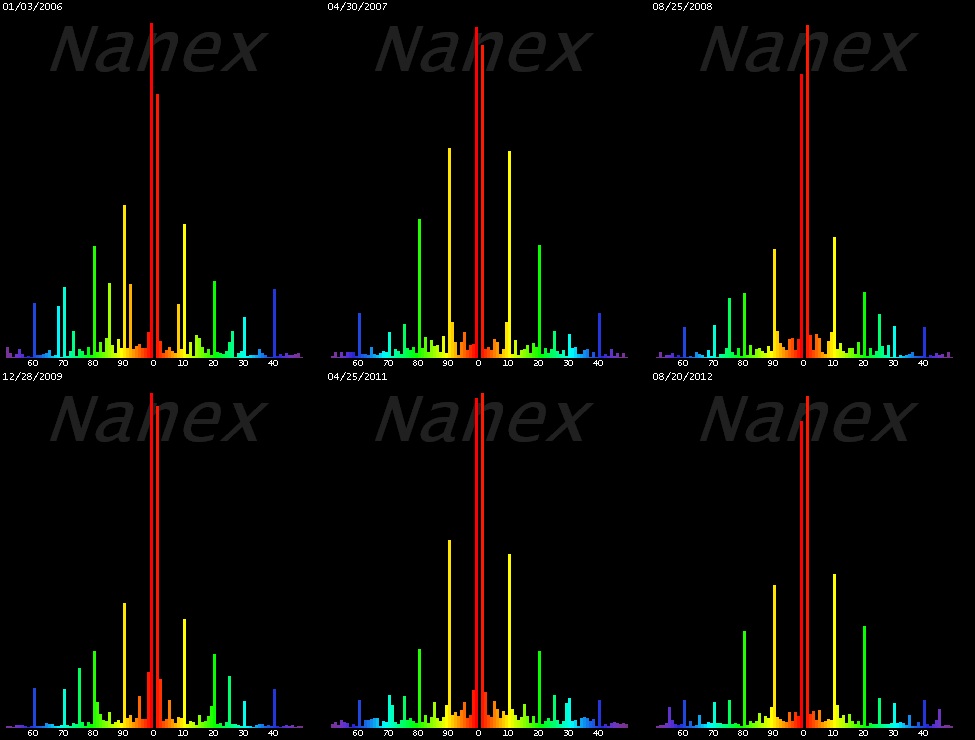
The animated image to the right shows the same distribution of sub-penny price trades as the chart above. It shows one day a week from January 2006 through August 20, 2012, and then loops back and repeats.

The two red lines at the center represent trades with fractional prices of x.xx99 (left) and x.xx01 (right). The two yellow lines near the center represent trades with fractional prices of x.xx90 (left) and x.xx10 (right).

Note how the peaks on the left and right of center form a near perfect mirror image. This mirror image pattern is remarkably consistent over time, seemingly unaffected by calm, active or hyperactive trading days.

Each image is scaled to the maximum shown so that the relative values of each sub-penny fractional slot can be seen. The scale isn't shown so that the image remains stable.


The table below shows the combined values of the two sides of the mirror image above. In other words, we sum the number of shares and transaction cost (value) for trades with sub-penny prices of 1/100 and 99/100 and place the results in row 1. Row 2 is the combination of sub-penny prices of 2/100 and 98/100 and so on.

The last 3 columns show the estimated benefit and harm to the 3 parties impacted by sub-penny pricing. These 3 parties are discussed in detail here, but for easy reference:

  1. Investor A: The retail investor whose order receives a slightly (laughably) better price.
  2. Internalizers: The one who provided the slightly better price (but jumped the queue).
  3. Investor B: The other retail investor whose order was not executed because an internalizer stepped ahead with the slightly better price. This is the guy no one talks about.

The first entry (row 1) tells us that 204 billion shares worth $5.1 trillion executed just $0.0001 away from the nearest cent. The group labeled Investor A benefited in these transactions by a total amount of $20.4 million. This is called retail price improvement. The group labeled Investor B lost at least $2 billion from these transactions. Finally, the group labeled INT (internalizers) received a benefit of at least $2 billion.

As Investor A and B often switch places, the real beneficiary of retail price improvement is not the retail investor.


You can download a pdf of this data here.


The Final Score:

Internalizers $5.5 Billion profit
Investor (A + B) $5.5 Billion loss


The next chart shows the growth of sub-penny trading between January 2006 through July 25, 2012. The line is a plot of sub-penny trades as a percentage of all trades. We used a monthly average of daily percentages to smooth out fluctuations.

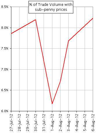
The next two charts show the impact of the Knight event that occurred on August 1, 2012. Knight's absence caused a significant reduction in trades priced in fractions of a cent, which returned after Knight recovered.

1. Chart showing % of share volume of trades with prices ending in 1/100 or 99/100ths of a penny (e.g. 50.4599 or 81.2301) 2. Chart showing % of share volume of trades with prices ending in a sub-penny fraction (excluding 1/2 cent because those can come from other sources).


Nanex Research