Nanex Research

Nanex ~ 19-Feb-2014 ~ Revisiting the DAX Crash


On February 6, 2014, in just 4/10ths of a second, the March 2014 DAX futures contract collapsed 2% and halted for almost 4 minutes. We posted our analysis on the same day.

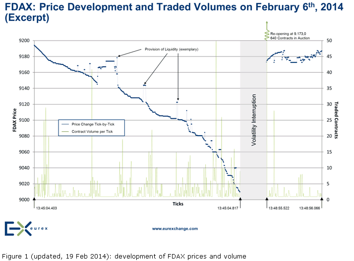
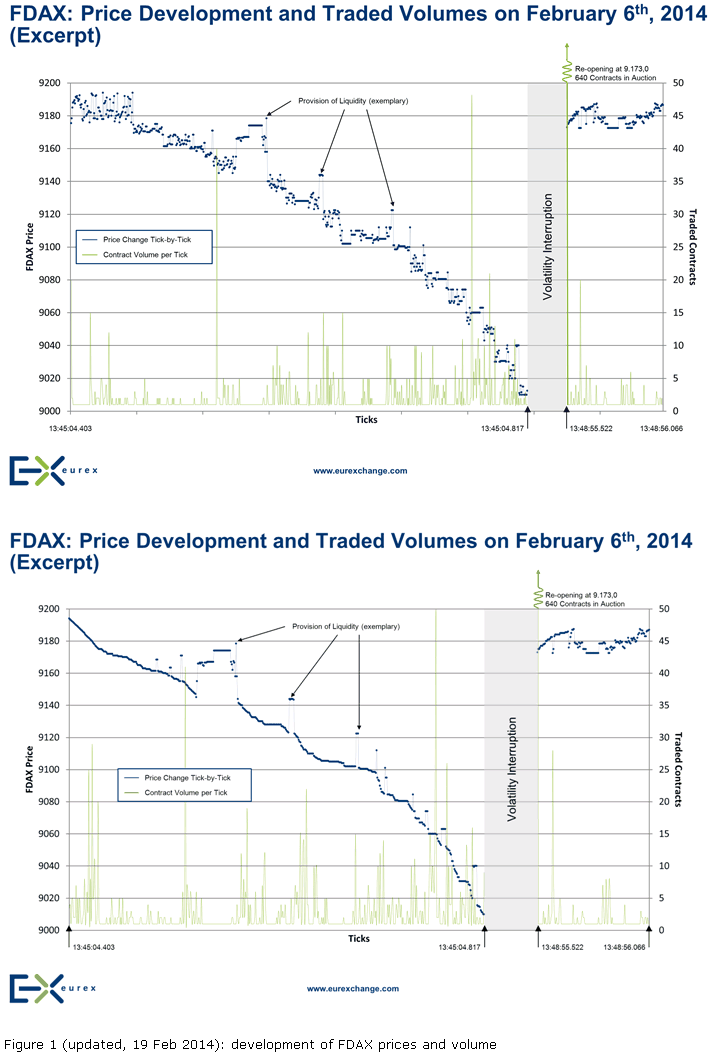
Eleven days later (February 17, 2014) Eurex published their in-depth view of the DAX crash and included a "tick chart" showing every one of the 494 trades (1,488 contracts) during the drop in the March 2014 futures contract. Almost immediately, we knew something was wrong with their tick chart: it did not represent the actual sequence of events during the crash! Worse, much of the discussion in their paper was clearly based on this erroneous view of what transpired during those alarming 400 milliseconds of time.

Our analysis found that there was a complete absence of liquidity due to the impending ECB news. Nonetheless, a seller of at least 187 contracts decided to hit all existing buy orders immediately, and this action dropped the price from 9194 to 9175.5 (18.5 points or 0.2%). These 187 contracts executed in 36 trades - each trade priced at or below the previous trade. Which means a tick chart will show a smooth drop of prices, which is exactly what our chart below shows.

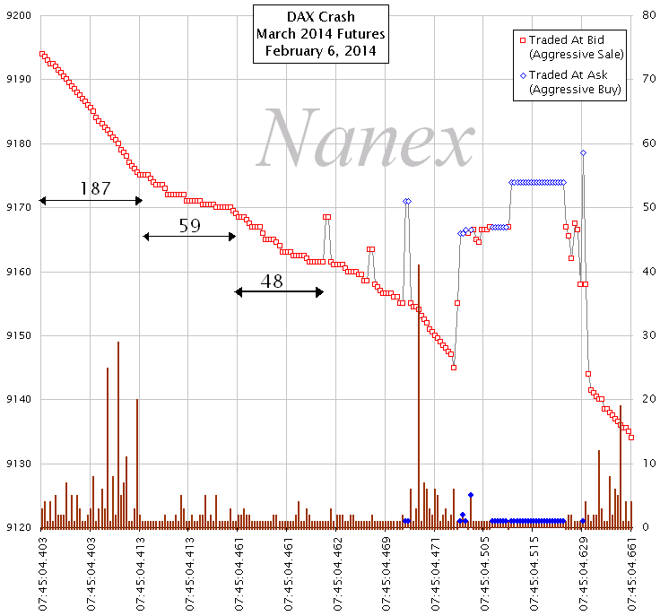

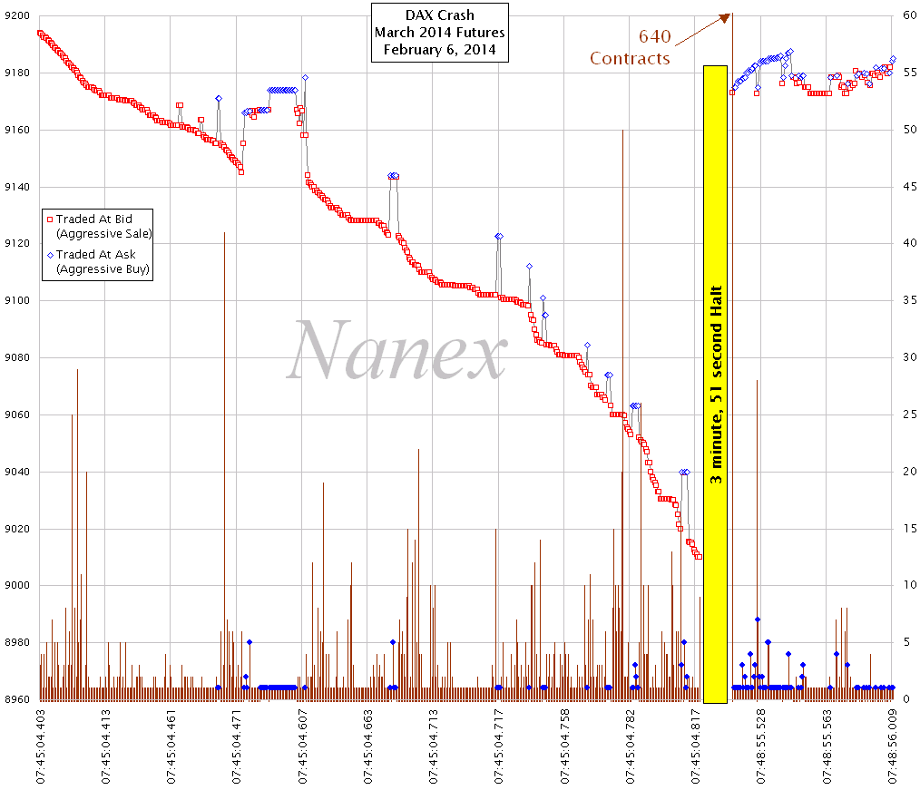
Now, compare our chart above, with the tick chart from the Eurex analysis page below. Specifically, look at the first group of prices above 9180 on the leftmost side of their chart (below). Notice how their chart shows trades that bounce all over in price? We know that is not how those trades executed. Worse, Eurex explains that this indicates orderly trading because there were plenty of upticks! But as you can see in our chart above, there were zero upticks during this time! In light of this spectacularly significant error, the rest of their discussion is highly suspect.


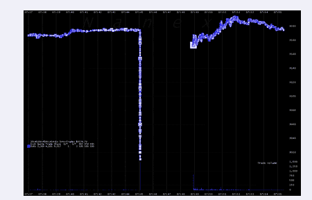
Nanex zoomed out view of the DAX crash.

Trades that match bid prices (an indication of aggressive selling) are shown as red squares. Trades that match ask prices (an indication of aggressive buying) are shown as blue diamonds. In the lower panel, the number of contracts executed for each trade is shown as a vertical line. Aggressive buying is indicated with a blue dot.


Eurex Changes Chart to Match Nanex

When we went to post this paper, we noticed a change to the chart in Eurex's paper! Their updated version is shown below (note the smooth drop in prices as we predicted!). Note how their chart (below) now matches our chart (above).


The image below toggles between the original and updated version. Note the disappearance of hundreds of upticks!


Nanex Research

Inquiries: pr@nanex.net